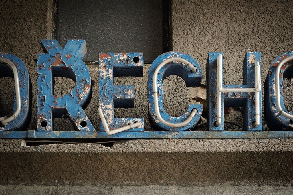
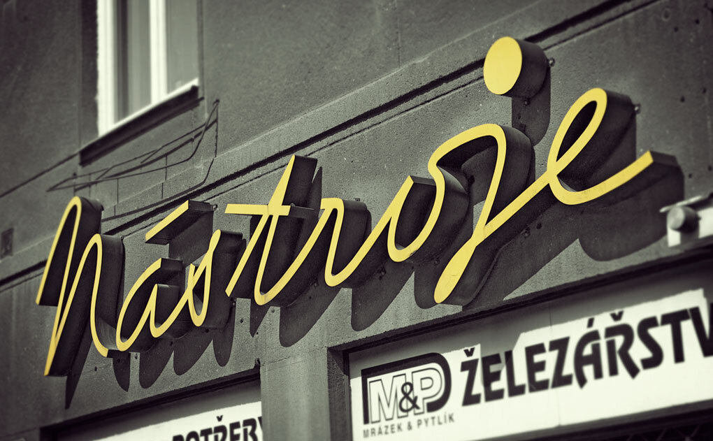
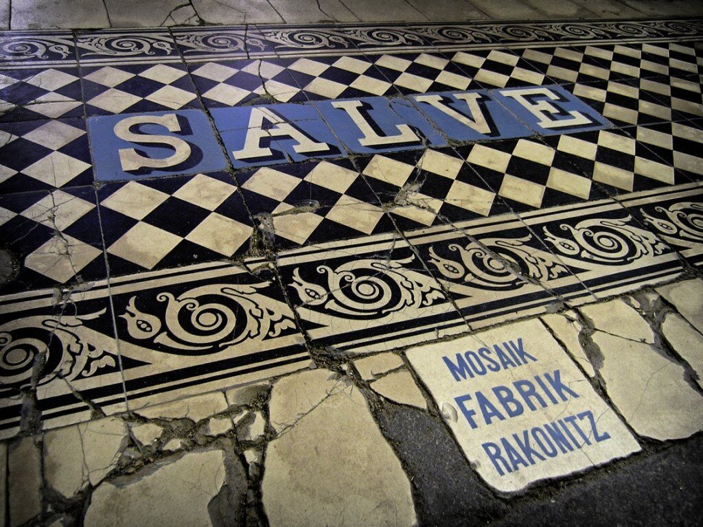
this amazing flicker set focuses on typography of all kinds in public spaces. i adore all of the textures and colors. thinking that i might have to prowl around this old town looking for some fancy lettering of my own!
{stumbled upon via designobserver, found via design:related}.

16 Comments
Love typography and all it's whimsical and classic beauty!
What a lovely thing to even think to focus on, I adore this idea and collection!
I love these photos. It seems we are so often bombarded by bad signage and misused fonts that it's always refreshing to have some design beauty pointed out. Thank you.
Old typography on buildings, mmmmm.
Love typography… but especially when found on old signs… I used old sign letters to spell out my son's name on his wall. Something about the uniqueness of them…
These are great. It would definitely make a good theme for your downtown.
what a great idea! completely gorgeous.
love letters….such a great idea! xo
sounds good to me and we look forward to your discoveries!
love it! I used to live there- you can tell it's Prague by the háčeks over the Rs.
the tile work in that last photo is wonderful!! what a collection of photos!
I'm crazy about the tile!
that yellow sign is so pretty!
P.S. Not to self-promote, but I just remembered I took some photos of the theaters in my town; this post reminded me of them, and actually I think you might have inspired the photo spree at the time.
http://three-or-four.blogspot.com/2009/05/is-this-home.html
: )
You make me want to go out and find more. If only my camera were with me…*sigh*
i was looking at these yesterday on my iPhone and mike leaned over and was all 'whoa! those are awesome!'
great post, erin! 🙂
Wau! I´m surprise. I love your blog and your pics. Almost hour browse them. And now… first two photos are from my country. These public space typography are from Czech republic, written in czech language. So that was big surprise 😀
Comments are moderated.