 Here we are. Scrubbed up and clean. Searchable and organized.
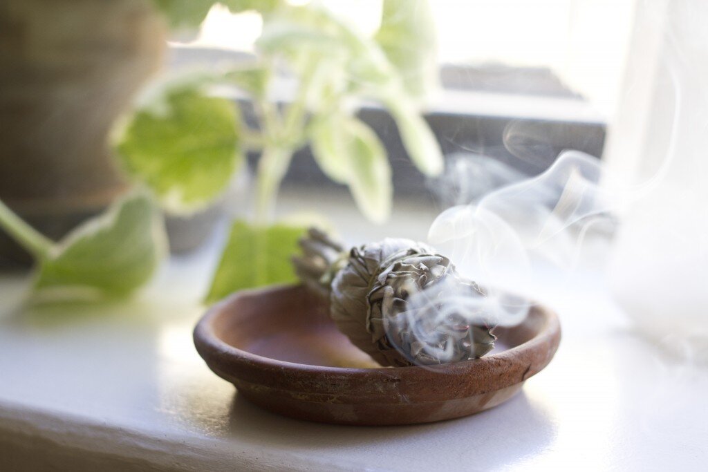
I’ve cleaned out the proverbial closets. I’ve tucked a few things into deep storage. But mostly I rearranged the shelves, dusted, polished, and ran over everything with a few extra passes of the vacuum. Just for good measure, I lit a bundle of white sage and borrowed from the ancient tradition of smudging my way into a fresh start.
I’ll let you guys do the poking around, but here are the basics about the new site:
Together with the incredible team at Orange Static, we moved everything over to WordPress. We made the photos a little bigger. We made the search engine more robust. Lourdes helped me slog through the archive of nearly 1,400 posts. We recategorized each and every one and left you all with a little menu of the main subheads right up at the top of the page. If you want to binge read a series, you can do that too. (For the full list, head to the series drop down menu in the navigation menu at the top of the page, or click on the series of choice on the sidebar.)
We added a page about my book, should you be hankering for a taste of what’s to come.
There’s contact info should you want to send a note to me directly.
We’ve left one full post on the homepage, followed by an easy-to-see grid of what came before. Archived posts are available in the same easy-peasy grids.
My incredible sponsors are all lined up and looking shiny on the right. My mug and a little bit about me can be found above that.
There are actually functioning links to all manner of social media sites and ways to help you share posts far and wide should you be so moved.
If you haven’t yet signed up for my newsletter, you can do that at the bottom of the page. (And you should: October letter is dropping this weekend.)
And if you’re not interested in the intricacies of blog redesigns, then I hope this post will serve as a simple reminder to do a good smudge.
Until tomorrow,
E.
30 Comments
I’m so happy that your blog is still sharing the same feeling from before. I’m a recent reader but this is a little corner on the web that brings me peace. Congratulations on your new space, simple and minimal, but au contraire of a tiny apartment, it definetly is holds space for a huge community of followers 🙂 !
Thanks for your kind note! So appreciated. So glad that you like what you see!
wonderful, extremely good and very marvellous. thank you. X
Thanks!
Lovely! Congrats on the redesign.
Thanks!
Looking great! Also, the mobile version is perfect.
Woot!
Love a tip to tail housecleaning! Looks beautiful and so glad you kept the original blog header. The whole aesthetic of it says it all and represents your little piece of the internet perfectly. Thank you.
Aww, me too! I’m a little sentimental about that old header by this stage!
What a beautiful space, congratulations!
Thank you, Jen!
Congratulations, Erin! It looks fantastic. A redesign that kept the essence of your blog. <3
xo
Thank you! So excited about it!
Lovely! Fresh starts are so liberating. I hope you can sit back now, take a breather and enjoy your hard work too.
Thanks Angela!
It looks so beautiful and fresh. It is exactly what I come to this site looking for.
Love the update, so sleek!
I’ve gotten very used to your old layout but I’m sure over time I’ll get a hang of this one. It does very nice though, simple but nice.
Just pre-ordered your book- obviously I’m a little excited. Love the new site look too! All good things-
Lovely!
Looking good my dear! Still feels like you, just a little more polished 🙂
It looks beautiful, I love it!
I love it! It looks so clean and fresh and incredibly user-friendly. Thank you and congrats!
~ f r e s h ~
LOVE the redesign and the warm/cozy feel of your blog. Kudos!
Truly beautiful redesign! I love it.
Congrats! The website looks great.
it’s clean.
simple.
elegant.
just like you!
I’ve been reading your blog since I had my bubba last year and I did wonder why it wasn’t updated. So refreshing to ponder upon it today. I run a design agency and I know yours have done a great job. I loved your aesthetic before and I love it just as much now 🙂 Props for the hard work! xx
Comments are moderated.