Tip # 187: Know your colors.
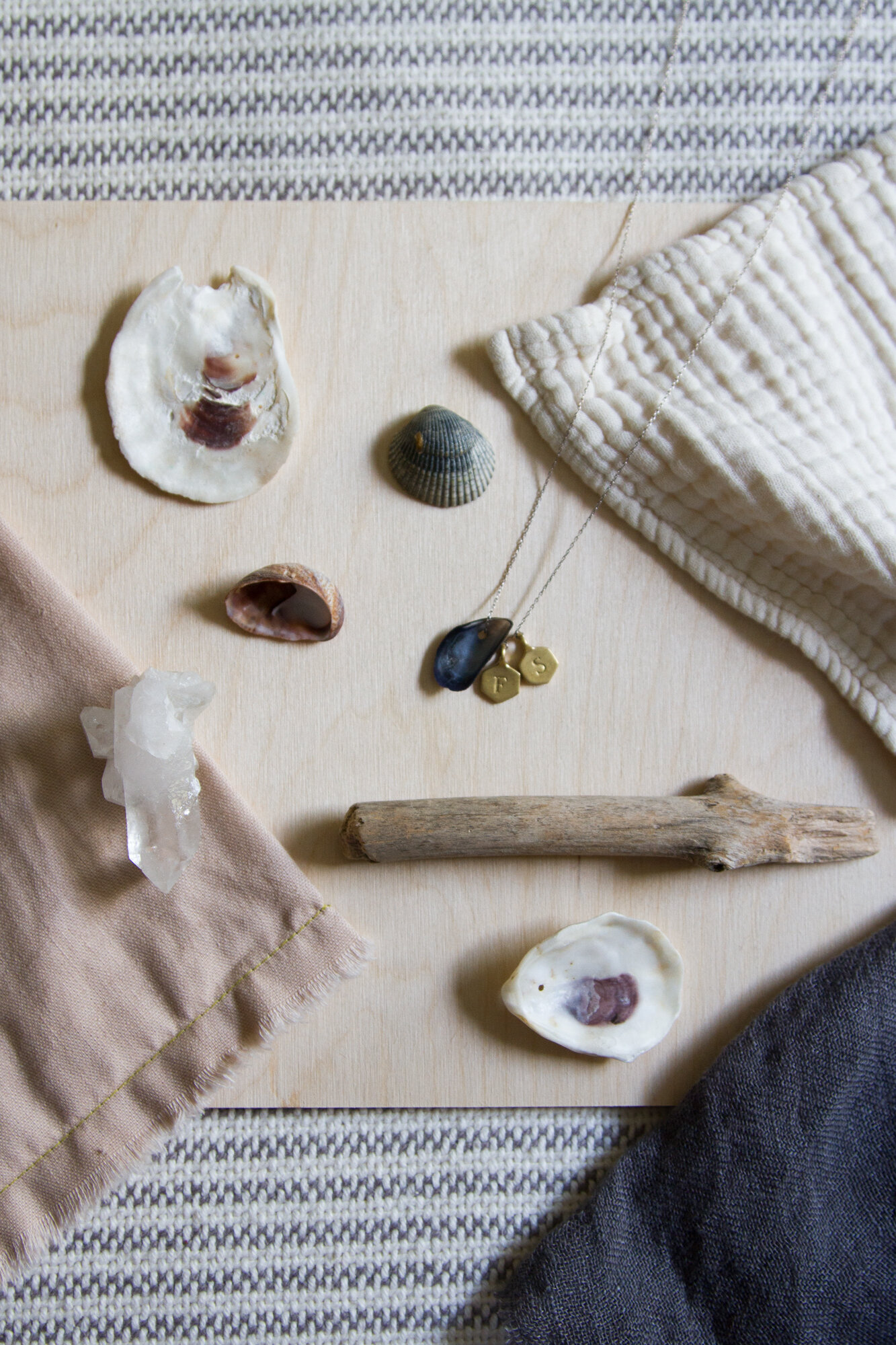
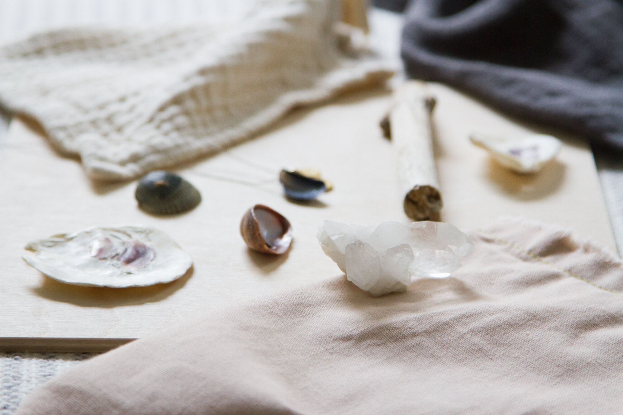
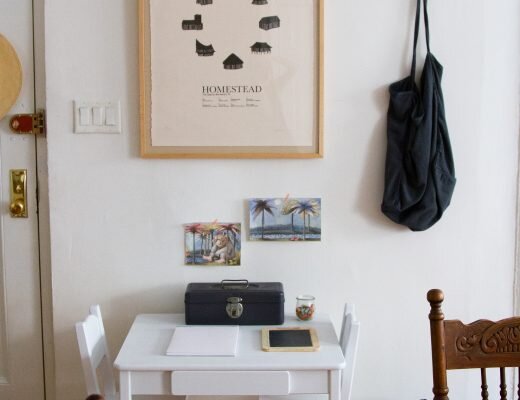
Lots of people come into my space, or catch glimpses of it online, and what they see is not color, but its absence. It’s true, there’s no riot of primary hues in my house. There isn’t a pop of anything to speak of. There aren’t any jewel tones, unless plums are in season, as they are now, and there’s a bowl full of them on the table. Folks see my white walls and bare wood and smatterings of grays and creams and other shades that get called neutral. Of course, I see the inside of a sea shell, or the sky at sunrise. I see driftwood and sand and the color of a shadow.
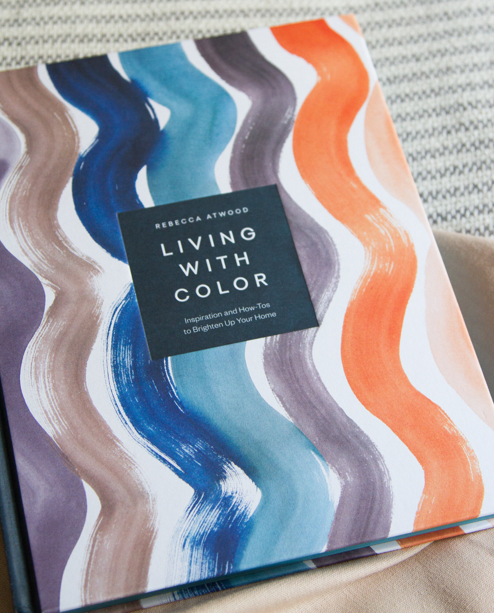
My friend Rebecca Atwood just published her second book, Living With Color. It’s full of inspiration and peeks into the color that hides behind other people’s walls, and it offers practical advice for finding your own colors. For making your space—whatever the size—feel like yours by exploring the way that color works inside it.
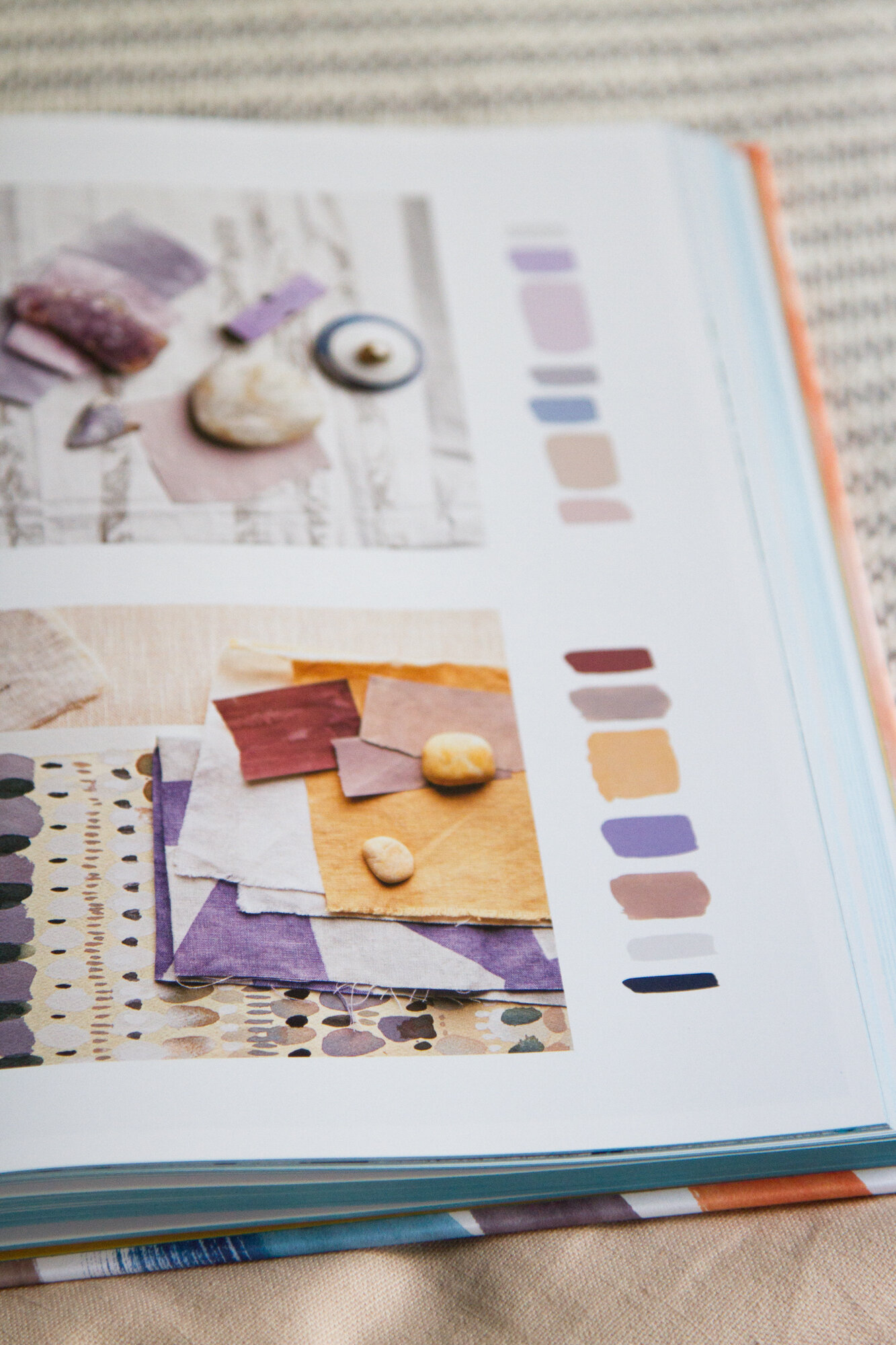
So much discussion of color and small spaces feels formulaic. We see click-bait-y articles from shelter sites about what colors to avoid or what to embrace; what’s allowed and what’s not. Becca’s approach is more personal than that. Instead, she coaxes us to find our own color palette. She goes even further, asking us remake the color wheel itself.
My white walls and soft neutrals aren’t for everyone, but I think what Becca captures so well is the idea that we all have visceral, gut reactions to color. Her book encourages readers to explore those reactions and dig deep into what she calls color connections—the memories, places, food, and stories that make us feel they way we do about certain shades and tones and textures.
Becca and I both grew up with New England beaches as the backdrops to our childhoods. And while she tends to be more bold with color than I am, for both of us, the foundation of our color memories come from this time spent at the beach—the particular magical purplish blue of a mussel shell, the warm shades of sand across a wind-swept beach, the shimmer of light on water, the way that water melts into the sky.
If you’re feeling unsure about your space, consider color. Not adding color necessarily, but understanding it.
To read more, you can find Living with Color: Inspiration and How-Tos to Brighten Up Your Home, wherever books are sold or loaned!

12 Comments
I love this post. I find muted colors of nature extremely soothing. 🙂
Me too!
Great tips!
I love Earth Tone colors and neutral natural colors similar to you. I absolutely love this post and you’re subtle way of changing our perspective or how we approach things. The photography is beautiful and complements it so well.❤
Atwood’s colour philosophy is very similar to mine. There are plenty of design/solution ideas on my (pinterest) mood boards for ongoing home renovations, but also lots of flora and fauna. My colour inspiration comes from spring blues, moody forest greens, mists, dappled lights, and autumnal seas. A Spring/Autumn cusp. And couldn’t agree more about how the spaces we have loved and lived in come back to us in such unexpected ways. Always and forever trying to recreate my Great Aunt’s and grandparents’ homes, though I might have snarked about this only a few years ago, while unconsciously doing just that. x
i have a deep connection or distain with color immediately. I adore blues (navy, indigo, torquoise) and greens (especially jade, emerald) and greys especially for my home. I hate hate HATE yellow, red and orange (not a primary color gal). Texture and quality are probably even more important to me but don’t have the funds or interest in buying overly expensive items I cannot afford. I’d rather have on nice linen pillow than ten from the bargain bin. Yet, another reason I love thrift shopping. For linens: simply throw them in the washer and they’re good as new – or even better with some lived in texture and soul. Dishes and other housewares just need some extra love and some dish soap.
I recently bought her new book and have loved it as much as I loved her first book. I am in my late 40s and have lived in the same home for 20+ years. Over that time I have found my color preferences for my home have changed with time. Sometimes I crave more color, other times I appreciate a more neutral palette. I hate to say I am a creature of contemporary culture, but I do find it impacts who my eye sees color. I am in a very white wall place right now. But that is what is fun about color….you can change your mind. This also impacts why I tend to purchase very neutral large furniture…I am not replacing that all the time. I do have one color that has been in my home for the entire 22 years… Aegean Green from Benjamin Moore. It is a gray/army green color that is in my kitchen, front door, porch floor, and soon to be the wall behind my bed with a white on the other ways. Think I will always like me a good army green color.
Thank you for your wise words. I live on an island in the Mediterranean Sea, and I also adore the white level of the walls and fabrics, with a little touch of blue.
They make me feel good.
What a beautiful post!
My home has a very similar palette although I’ve incorporated more distinctly blue shades. It makes me feel very calm to have a common scheme throughout my house; reminds me of the vastness of the ocean and sky. I have touches of red but those items were gifts or hand me downs. They serve a purpose for now, but overtime I think I will replace them because, in my eyes, they sit rather uncomfortably in my home. I have indulged my daughter’s love of pink however. While the walls will never be pink, a soft pink duvet and accessories give the “feeling of pink”, and it is a space that’s truly hers. I’ve always be drawn to blue but often felt self conscious that I’m too “boring” or “safe”. One of the best parts about growing older is that you feel more empowered to just embrace what is naturally appealing and forget about the rest of it.
I chuckled when I read this. I frequently dream of stark white walls and furniture, but I have come to realise, that it’s not my home colours. My home colours are soft yellows, naturals, a dash of gold and a few accents in blue or red. If I could live in a honey pot to survive the dark and dreary autumn and winter in my first floor city flat, I would! Ironically enough, apart from gold jewelry and the odd T-shirt, I never actually wear the colours I furnish my flat in. I wear red, crimson, claret, burgundy, purple, pink, black and hues of blue with spalshes of white.
I love all my colors but when it comes to my home and space I need splashes of eeds and blue here and there. A new reader but loving what all is there in here.
Comments are moderated.