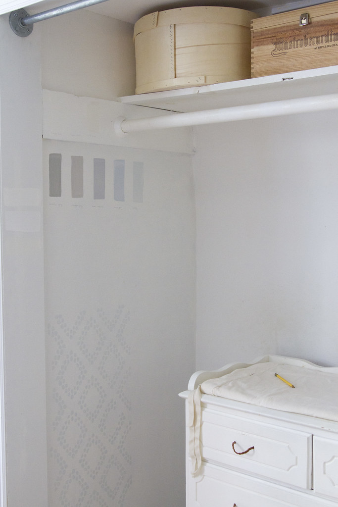
 Making good use of closet space in a tiny apartment comes with the territory. And transforming a closet into something that more closely resembles living space than storage space is one of the oldest tricks in the small-space living book.
From the minute we moved into our current apartment, we knew we’d be using one of the closets to house a dresser/changing table for Faye, not to mention as a space to stash the large cloth diapering pail we’d be using. We spruced the closet up a bit by removing the sliding doors so that we could access the space more completely and we added a metal-pipe-turned-curtain-rod and a pair of white curtains (that just recently met their demise) so that we could close the corner off if we wanted to.
But the problem with this particular closet is that since putting it to work as Faye’s changing area, it’s gotten more than a little grimy. A few weeks ago I noticed that the wall behind her dresser had become streaked and stained with a summer’s worth of tiny plum-juice covered fingers and sandy toes wriggling their way across the wall. Because the closet walls were painted in a thin coat of flat white paint, a scrub down didn’t help lift the traces of her acrobatic diaper changes.
So when Benjamin Moore approached me about trying their Natura paint line, I knew the closet was the right spot to give a fresh coat. In fact, painting the inside of a closet has always been one of those teeny tiny fixes that I swear by. Rental closets tend to be places that get more than a little forgotten. A coat or two of fresh paint can make all the difference in making any space your own, but I’ve found that ironically the effect is especially noticeable in a closet. Even if you don’t turn your closet into a room of its own, being able to slide linens and clothes onto shelves and alongside walls that have been freshly painted can be just what you need to do to feel settled into a new place.
Choosing Paint
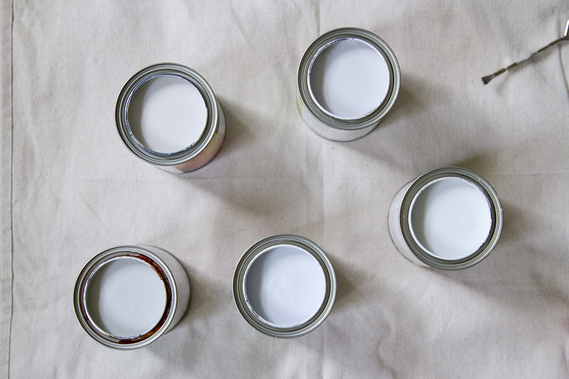 I’ve always been committed to choosing zero-VOC paint, but in getting the chance to try Natura, we were able to use Benjamin Moore’s highest rated environmentally friendly paint. Full disclosure: When I painted our bedroom furniture in Benjamin Moore’s paint two winters ago, I used their Ultra Spec 500—another zero-VOC option, but without the same promise of zero emissions and superior paint quality of Natura. (Ah-ha!). Having had the opportunity to test-drive Natura for myself, I realize the difference. Put in simple terms: the Natura paint is noticeably less smelly. Natura is also certified asthma and allergy friendly by the Asthma and Allergy Foundation of America and has a Silver rating from Cradle to Cradle—a third-party group tasked with identifying and rating environmentally responsible products. If you need more convincing, the paint has earned Benjamin Moore’s own Green Promise designation and was named the 2015 Product of the Year in the Interior Paint category. I’m not a paint expert, but I do feel good about this product.
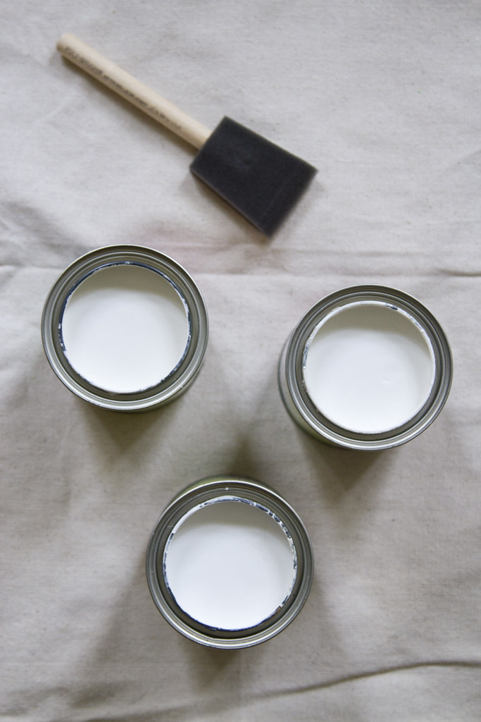 The Natura line comes in three finishes—flat, eggshell, and semi-gloss. I chose an eggshell finish for the walls which will mean that I’ll have an easier time scrubbing down those grimy spots. For the woodwork—closet shelf and pole, included—I chose a semi-gloss finish, which will be even more durable as I slide things across the pole and take boxes on and off the shelf.
Choosing Colors
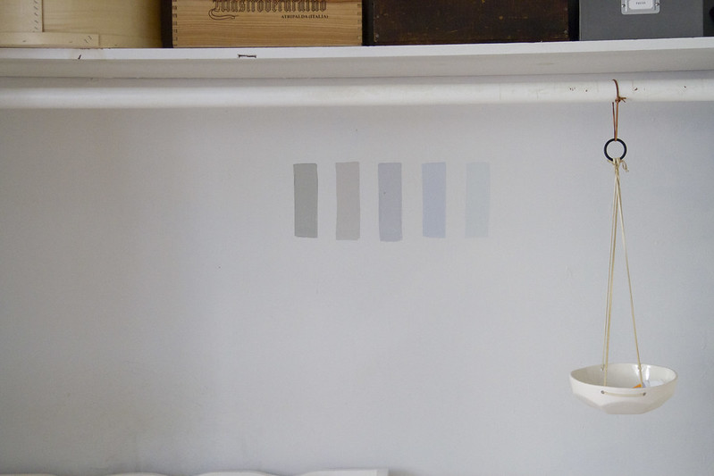 Do you know the moment in Patricia MacLachlan’s Sarah Plain and Tall when Sarah selects colored pencils in gray, and blue, and green because they’re the colors of the sea? The passage has stuck with me my entire life, and they’re my favorite colors, too. I ordered samples of five different shades of blue and gray and ever-so-slightly green and three different whites to test in patches in our closet.
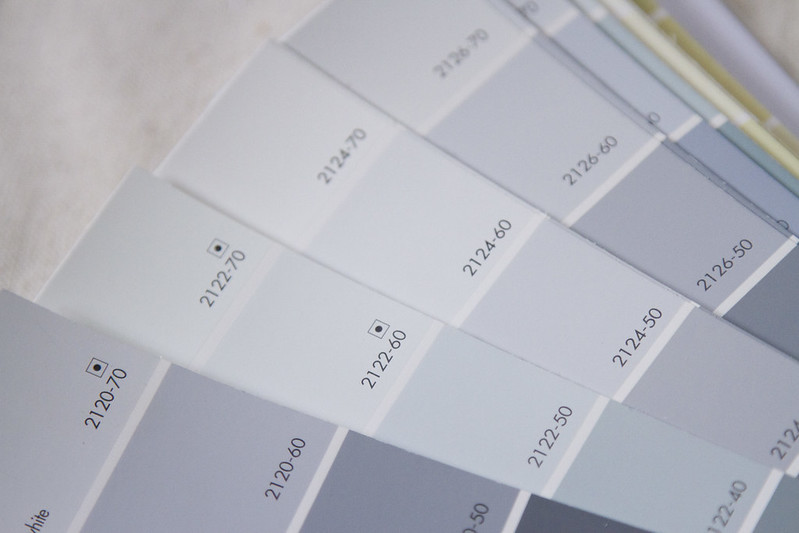
I used Benjamin Moore fan decks to help choose what colors I would test. Happily, Natura is available in any Benjamin Moore color.
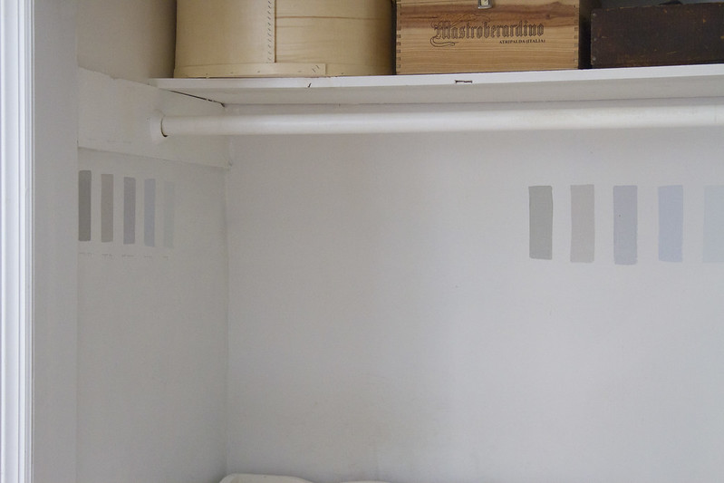 Then I tested patches on two different walls to get a sense of how the paint would behave given different light conditions. After putting together a little inspiration board on Pinterest, I decided to ease into color, by adding a delicate touch with the help of a stencil. I can be a little bit of a color and pattern-phobe, so a simple diamond pattern for a closet wall seemed like the perfect way to add a bit of color without going too crazy.
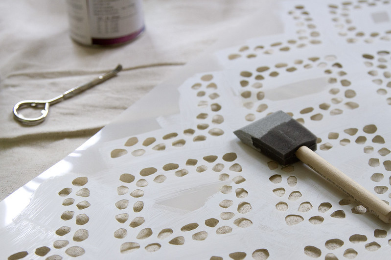
The folks at Stencilit were kind enough to send me one of their Diamonds Wall Stencils to try for this project. I chose a 40-inch stencil to make quicker work of the project and I painted a test-patch on the wall before committing to the color.
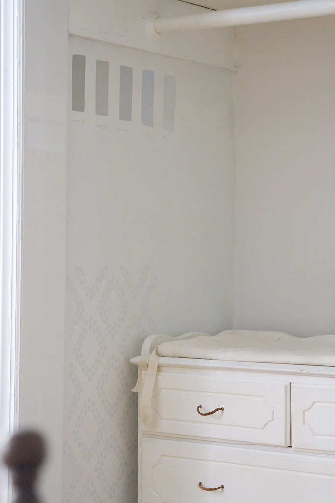
For the curious, here’s a list of the shades that I tried (from left to right and top to bottom):
Simply White (2143-70) – A pure, calm white. I chose this one.
Super White (PM-1) – A bright, sparkly white.
White Dove (OC-71) – My parents always swear by this white in their house. It was a little too yellow for this project.
Stonington Gray (HC-170) – A pretty solid gray, though too dark for this project.
Coventry Gray (HC-169) – Another nice gray with a slightly brown tint.
Sweet Innocence (2125-50) – A slightly purply gray.
Beacon Gray (2128-60) – This blueish gray was close to what I wanted, but a shade too dark.
Iceberg (2122-50) – I loved this shade but ultimately decided it was a little too cool and a little too green.
After testing all of the colors on a few different spots in the closet, I decided to go just a shade lighter than Beacon Gray for the stencil color, and settled on the Lily White (2128-70) instead; it’s a super pale gray with a blue-ish tint that complements the deep dark blue of the Abyss (2128-20) color we painted our bedroom furniture. (And, I can’t help myself, I liked the name. My great, great Aunt Ruth always referred to bedtime as Lily White’s party and I’m a sucker for a story.) The walls and woodwork will both get Simply White in different finishes.
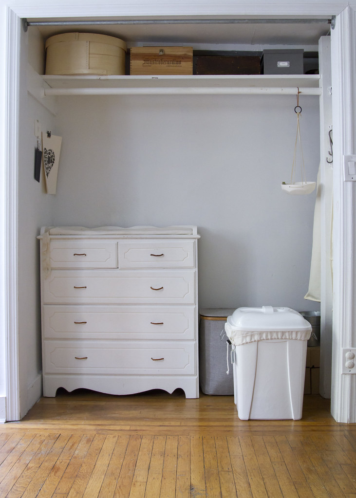 Here’s the before shot of the closet. I’m tackling the project this coming week and I’ll be back with the afters after that. Stay tuned.
This post was sponsored by Benjamin Moore’s Natura Paint. Opinions, my own. Reading My Tea Leaves is proudly supported by businesses striving to do better. Thanks for supporting the brands that help this blog thrive.



8 Comments
I have loved that passage in Sarah Plain and Tall since first reading it too! It's funny what sticks with you. Your colors are gorgeous! Can't wait to see the finished project.
Oh! That came out gorgeous! I recently did something similar with one of my apartment's closets… though in my case, I turned it into the library.
Are you going to do anything with the diaper pail to make it less obtrusive?
Ha! It is kind of in your face now isn't it? Thinking about rehanging a curtain to hide it, but haven't quite gotten there yet! There's a fine line between pretty and functional and when it comes to diapers, I try to keep things functional!
I can't wait to see the final product! This looks like something I can pull off!
http://www.velee.weebly.com
it looks lovely! i like that you chose a light color for the closet space. my apartment's bedrooms are small and i knew going in that i would have to chose a light color to keep the space bright.
ps. i'm curious, how did the curtains meet their demise?
Blue and gray and green, the colors of the sea! Love this quote from Sarah, Plain and Tall!
I love the colors and pattern you chose! Ever since I've known to (which is since having my first baby 3.5 years ago), I've used zero-VOC paint, but it's wonderful to know the differences of the Benjamin Moore Natura line – that sounds perfect.
Comments are moderated.