Farrow & Ball supplied the paint and a complimentary Colour Consultation with one of their Colour Consultants for this post. All opinions are my own.
When we moved into this apartment in September, every room save the kitchen and bathroom was painted in the same classic rental color—somewhere between white and yellow and not-quite-cream. It’s the kind of color that you can kind of fudge into looking semi-okay for a photograph but that feels pretty blah to actually live with. I knew I could brighten everything up with a coat of fresh white paint and be done with it, but I also felt like this was a chance to experiment with bringing in some color and playing with light.
The problem is, adding colors to my walls unnerves me. In most things home-related, I’d say I’m fairly confident, but paint colors feel so unpredictable. What if I choose a green and it ends up being too yellow? What if a blue reads purple? What if the mustard turns chartreuse by day and goes brown by night? In the grand scheme of things, people might say “it’s just paint,” and “you can always change it” and they’d be correct, but it’s also true that painting is an investment of real time and money. If I was going to be painting this place myself in between work and child wrangling and generally running around like a chicken with my head cut-off, I wanted to get it right the first time.
I decided to call in the experts. Beloved British paint company, Farrow & Ball, has taken their Colour Consultancy virtual since the start of the pandemic and so I reached out to see if they might be willing to let me take the service for a test drive. To my delight, they agreed! Here’s how it went:

Before my consultation, at my appointed Colour Consultant’s request, I put together pinboards for each room. This was the easy part. I filled virtual boards with images of my own home, snapshots spotted around the internet and favorite paintings from museum collections, that together represented the palette of colors that I like the best: soft greens and golds and the colors of the sea. Among the inspiration is Fairfield Porter’s Calm Morning and Maggie Pate’s indigo-dyed hands. Forever a fan of Lois Dodd’s window paintings, I added her View Through Elliot’s Shack Looking South and Blue Sky Morning. I included an image I found of a pale pink shirt on a concrete floor, and others with greenery and bits of warm wood against shadowy walls.
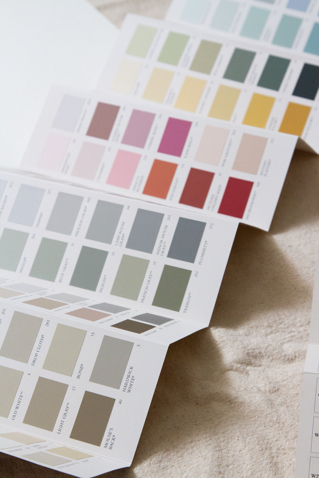
On the morning of my consultation, a Farrow & Ball Color Fan arrived to my door and at the scheduled time, my Colour Consultant, Jet Patterson, gave me a call. We met via video chat and together we toured the apartment, me carrying my laptop around to show her the rooms and the light and generally chatting her ear off as I showed her how the space is configured. For the purposes of this consultation, we focused on the three main rooms of our apartment: our dining/living room, our bedroom, and the kids’ room. Each of these rooms flows into the next via French doors and so I wanted to create a palette that could work across the spaces. Jet understood.
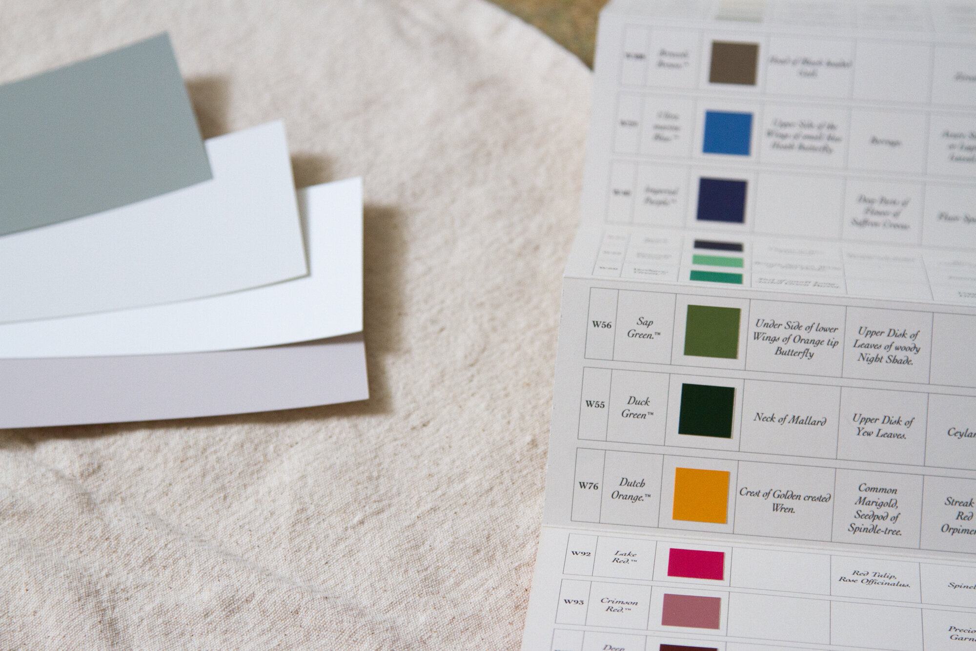
Next, at her direction, I unscrewed the color fan so I could remove individual cards from the deck and tape them to directly to the walls. The suggestions were hers—based on my pinboards, and what she saw in front of her—but the process felt collaborative. We started with a row of a dozen or more colors taped to my living room wall and narrowed things down through an immediate process of elimination. “Pull down anything you don’t like,” she suggested, and I snatched down five or six shades that I knew wouldn’t do.
Even through the computer screen, Jet’s mastery of the colors was impressive and a real comfort. (Once, when I accidentally pulled a card in the wrong shade of white, she was able to tell immediately and asked me to double-check the name.) She used my gut reactions to certain colors to make sense of what it was that I after and what might work best in our space. We returned to the color cards, we hung them up facing the light and away from it. Over the course of an hour, as we worked our way through the apartment she used words like luminous and misty to describe the paint colors. (I used words like baby formula and grubby to describe what I wanted to avoid.)
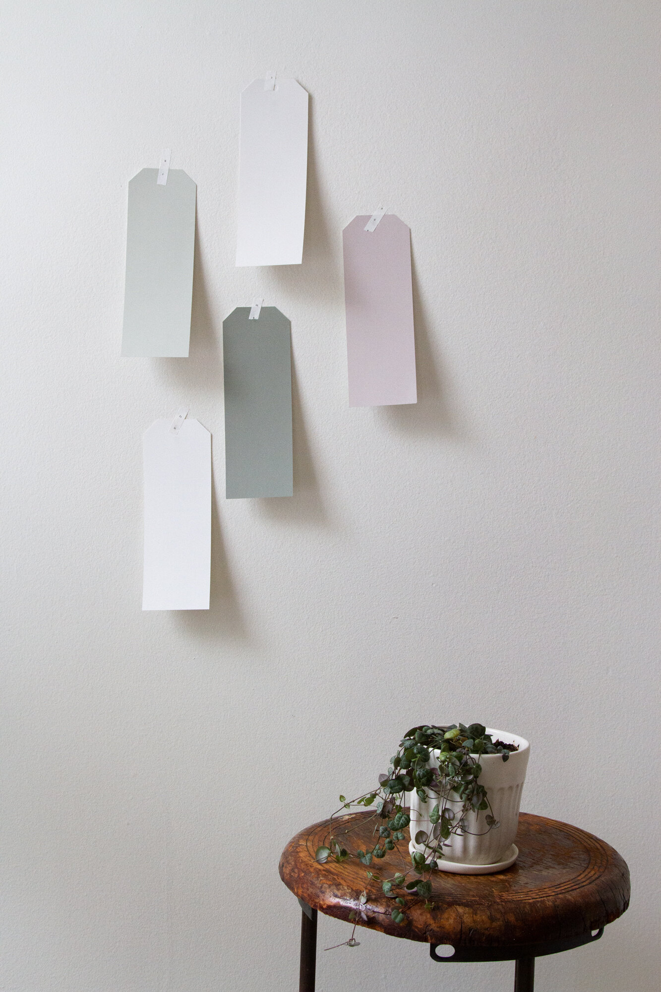
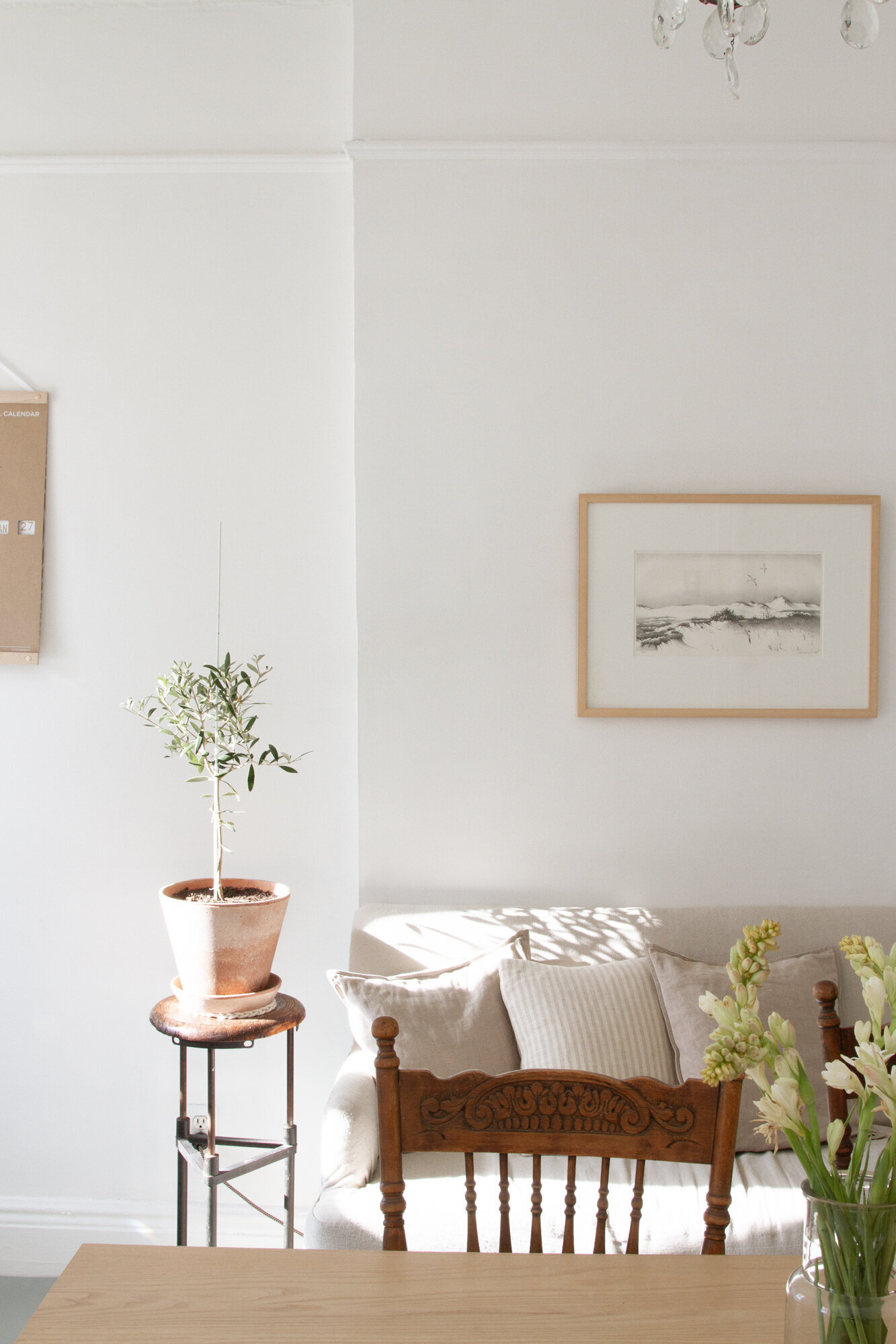
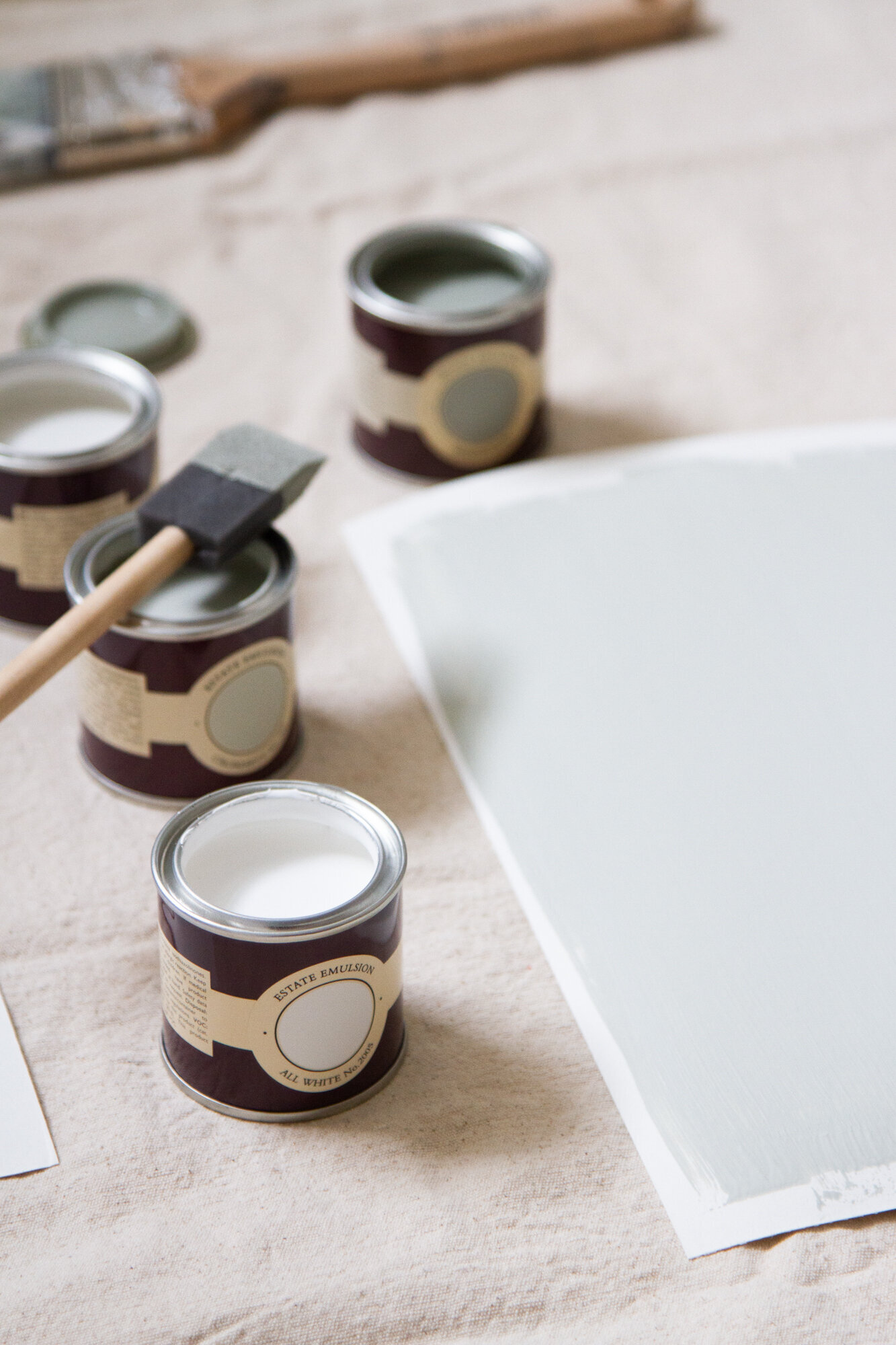
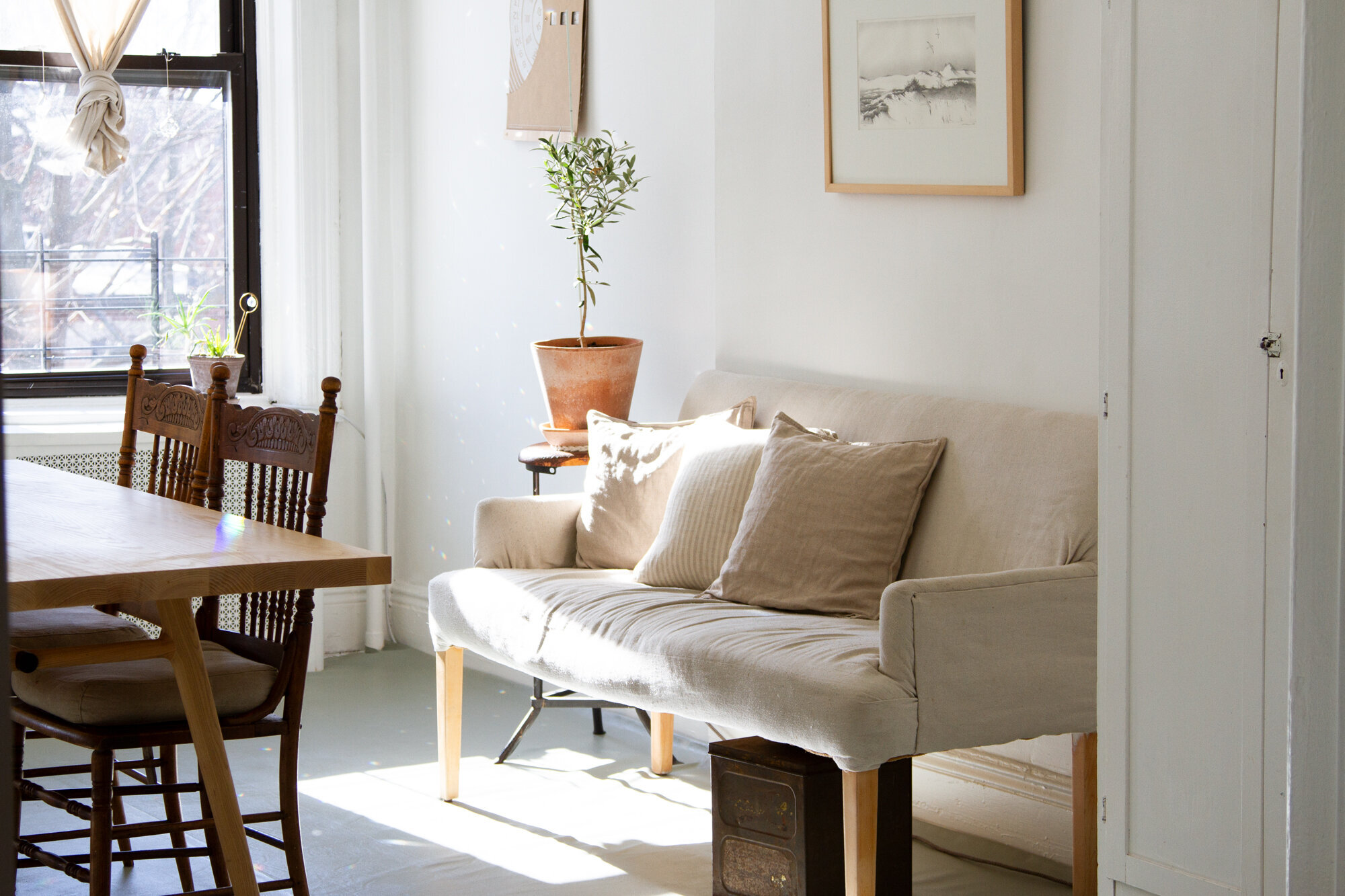
By the end of the call we’d decided on four possible paints—two whites and two colors. Jet placed an order for samples and just a few days later four tiny pots arrived to my apartment: All White for walls and trim in the dining room, Strong White for the trim in the kids’ room (to contrast with All White on the walls), Cromarty for our bedroom walls, and Pigeon for the floor of the dining room. (The pale pink on the wall above is Peignoir, which I opted against.)
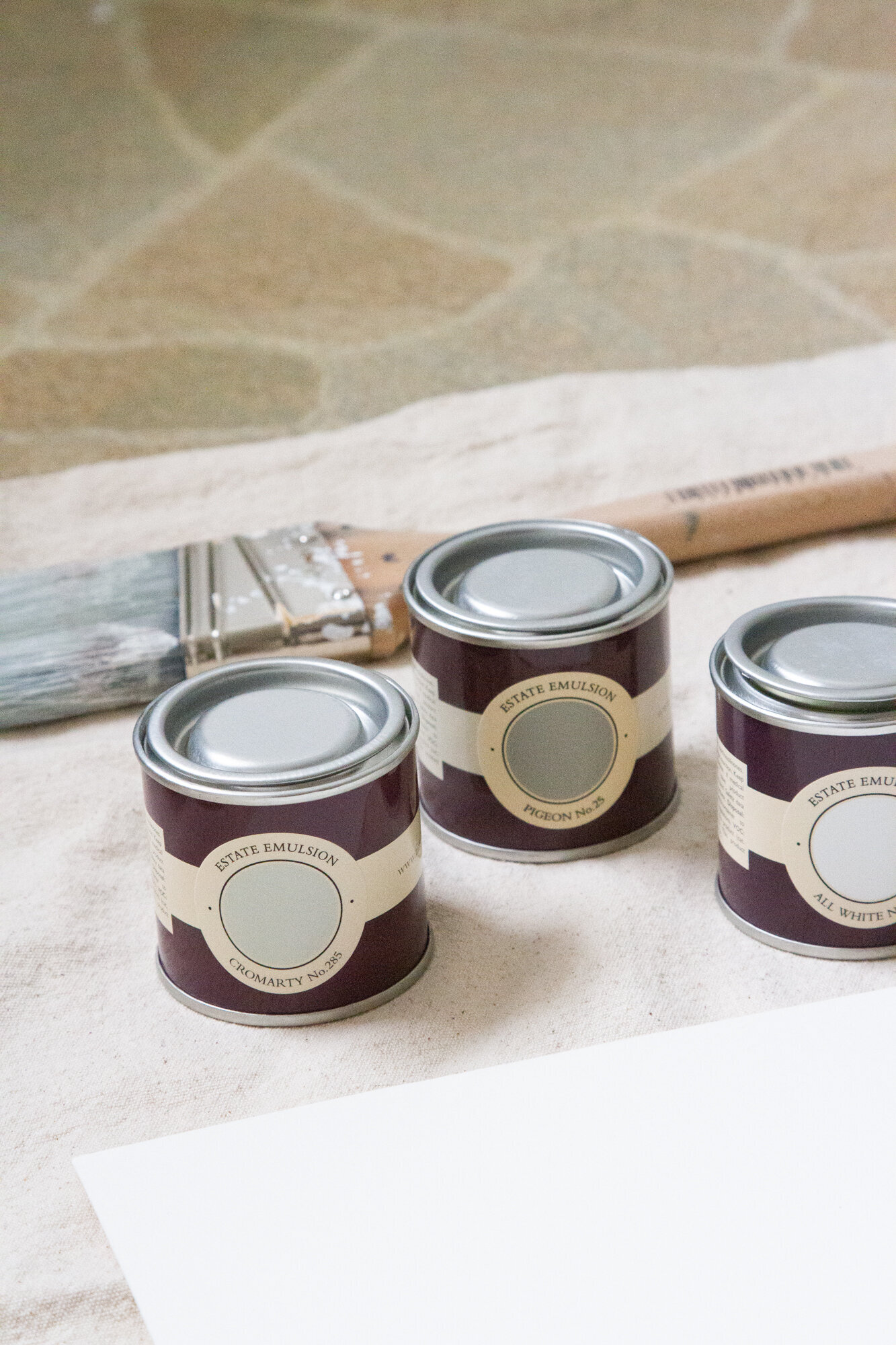
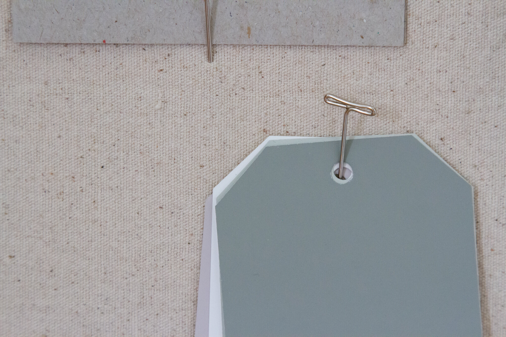
Rather than painting swatches directly on the walls, Jet suggested I paint sheets of 8 x 12 watercolor paper with the samples. The sturdy sheets of paper meant I could move the colors around the apartment, paying attention to how they caught the light and changed depending on the time of day. For weeks I moved them around our space until I finally placed the order for all four of the colors. I’ve been working on the painting ever since.
No surprise, this is a work in progress. I’ve got the kids’ room to finish and the trim behind my bed to complete. There are a few spots that need touching up and the help of a painter who’s taller than I am, but the impact already is significant.
As part of the consultation Jet offered advice on paint finishes for walls, ceilings, and trim. On all the walls we decided on Farrow & Ball’s newest finish, Modern Emulsion. It’s beautiful. Not as glossy as an eggshell finish, but still completely washable and formulated specifically for busy areas (which is to say every area in a small apartment with three children). Have no doubt, the durability and washability has already been roundly tested with splattered spaghetti sauce and watercolors and frozen blueberry fingerprints.
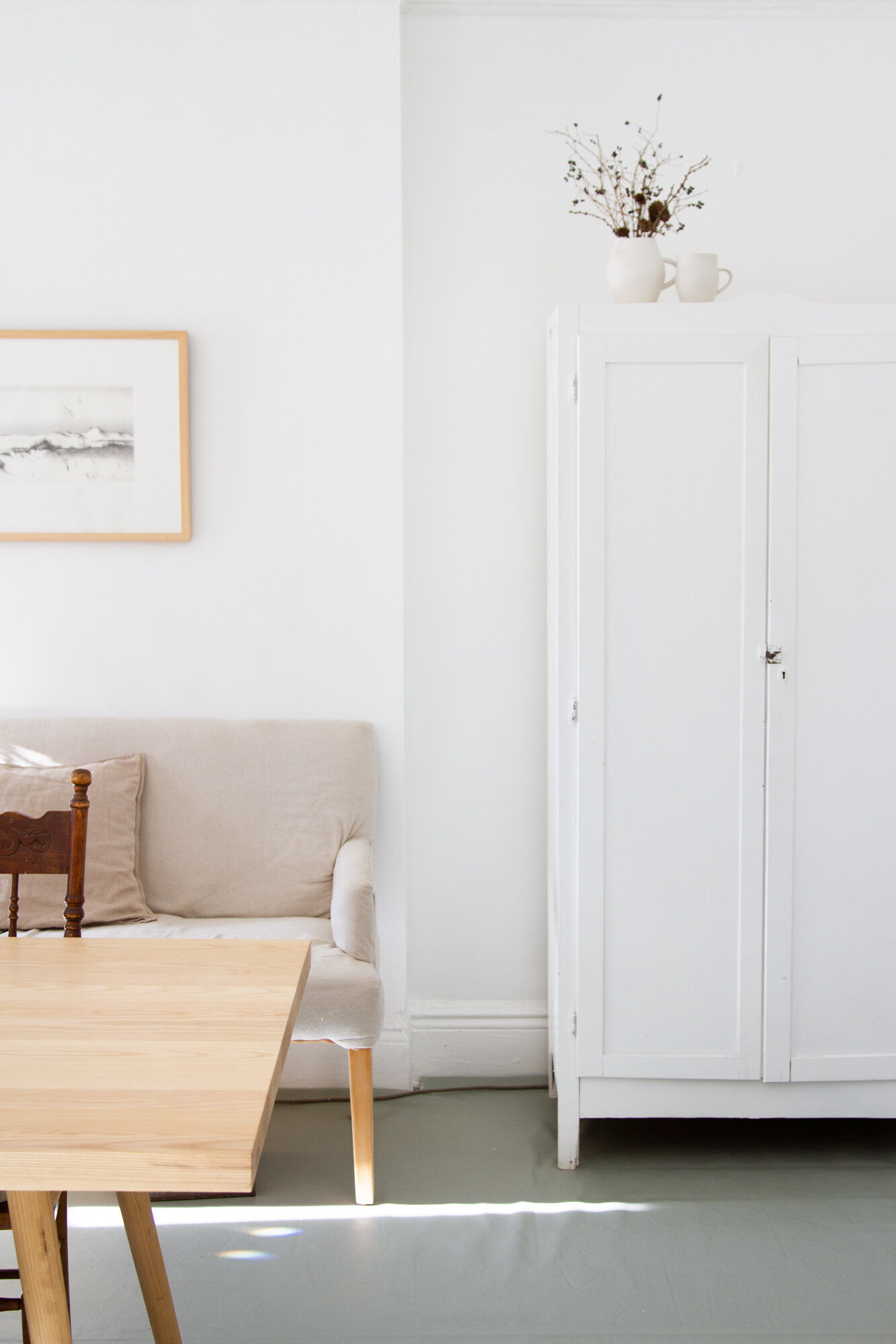
For the trim and the floor cloth finishes, we decided on Estate Eggshell and on the ceilings, we went with a Dead Flat finish. If you live in an old house or a rental, ceilings are places that are often neglected. In our bedroom, the ceiling had multiple patches in different shades and finishes and a fresh coat of flat paint has freshened up the room considerably.
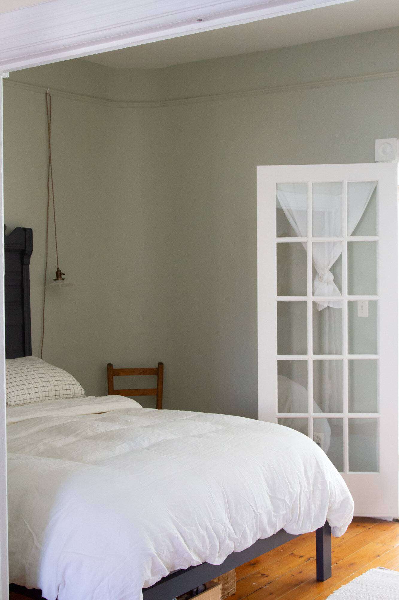
At Jet’s urging, I also took the wall color up the full height of the room. The previous wall color stopped at the picture rail and left to my own devices I would have probably followed suit. I’m so glad I listened to Jet instead. The rooms feel so much taller and more elegant this way.
As for the colors, I love them. The All White is as bright and airy as I’d hoped and a vast improvement over the not-quite-cream. The Pigeon on the dining room floor is enough of a departure from my usual choices to feel fresh and exciting but it’s subtle enough to not overwhelm the room and it pairs beautifully with the adjacent Cromarty in our bedroom. Cromarty is a color that does indeed shift throughout the day—ranging from a truly pale gray green to something much darker at night, but I’m less tempted now to call it unpredictable. To borrow Jet’s words, it’s mostly just remarkably luminous.
If you’re curious about booking Farrow & Ball’s Colour Consultancy, here are the details:
How to book: You can book a Colour Consultation online through a portal on the Farrow & Ball website. You note the date and time you’d prefer, and someone from the team at Farrow & Ball gets in touch to coordinate and confirm.
What’s included: Farrow & Ball’s virtual service includes a Farrow & Ball Colour Fan featuring the company’s 132 colors, a one-hour video consultation, four sample pots, and a digital specification sheet that can be used to place your order.
Cost: In the US, a Colour Consultancy costs $250. (Farrow & Ball is currently offering 15% off paint and paper when you complete your in-home or virtual colour consultation before February 28, 2021. The Discount is applied after completed consultation and valid until 04/04/21. Offer available in the UK, US, Canada, France and Germany only.)
Farrow & Ball supplied the paint and a complimentary Colour Consultation with one of their Colour Consultants for this post. All opinions are my own.


35 Comments
My entire house is painted in Farrow & Ball colors. Not a day goes by where I’m anything less than pleased as punch (including my Peignoir-painted bedroom) xx
Aaaah! Sounds so beautiful!
Ooo I can’t wait to try this. Would the Modern Emulsion finish pass muster with a landlord who is strangely obsessed with matte finish, would you say?
Yessss!
Cloth floor?
Please say more!
tk tk! I promise!
People always ask why I would spend money on Farrow and Ball paint in a rental. But I’m sitting here in my living room painted F&B French Gray and realizing it brings me joy on a daily basis. I feel like ESPECIALLY in a rental where there is so little you can truly change, bringing beautiful color to your walls means even more. Thank you for shedding light on the color consultant process and pricing! I have always considered it and I really should have done it before painting my office — it might have saved me from painting 25 poster boards of their sample pots haha. Next time!
Ah, yes! (French Gray was also on my list!) The thing about spending money on painting a place—in whatever color or brand it is that pleases you—is that that value *always* lies in how it makes you feel personally!
Beautiful Erin! Will they do a consult for exterior paint as well?
Yup!
What’s been your experience with landlords and painting? We just moved to Chicago into an apartment painted in a dozen different horrible shades of brown and gray (our bedroom alone somehow at least three different shades of gray). The landlord is insisting that if we paint the apartment white, we’ll have to repaint back to these horrible mismatched colors when we move out. Dreaming daily of fresh paint on these walls, but I don’t want to be saddled with another massive paint job when we’re trying to move!
I’ve had lots of landlords and they’ve run the gamut from being quite prescriptive to what we could or couldn’t do to giving carte blanche! Maybe you could go for a compromise and suggest a fresh coat of a neutral color that’s not white but that’s at least not mismatched? Good luck! (And if you’re repainting in the color that they’re asking for, that sounds like a job they should cover!)
The colours you chose are beautiful, and this post and photos are beautiful. I so appreciate your artful approach to the blog and beyond! Less artful, I imagine, are the logistics of painting piece by piece in snippets of time as you have them. In spite of that, I wonder if you might share those in a future post? I’ve always thought of painting as an intimidating all-or-nothing task and would love to know how you chip away at it.
Looks splendid!!!
What about the ceilings?
all white in dead flat finish throughout! I love them!
Tips for painting ceilings? I’ve been slowly chipping away at repainting our house during nap times, but even considering painting our ceilings immobilizes me!
same! we’ve done two so far and the third is a tin ceiling with very deep grooves that frankly makes me want to cry. i think ceilings really need a day when you can move furniture out of the room or at least to the center and get two coats done in one day–too much work to move everything otherwise. definitely recommend investing in a long wooden handle to screw onto your paint roller!
I loved reading this! We are halfway through a renovation and planning to do a F&B consult as soon as we have walls again! I added Cromarty to my list after seeing it in your space.
Looks fabulous! We used F & B Railings on our doors and absolutely love the color! What shade of white did you use on your wardrobe in your living room? Is that F & B as well? Looks great! 🙂
that’s a hodge podge! we got it from our buy nothing group and it was white! i mostly just touched it up with leftover benjamin moore simply white that i had–another favorite white of mine!
We refer to farrow and ball as “liquid gold” in our house. We’ve used it throughout and I only use it in clients homes also. I am a big fan of Wevet, Railings and Strong White.
ha! yes! i’m so tempted to do railings on the kitchen window frame…but i’m nervous i might be pushing it landlord wise with black paint…
Love Farrow & Ball since a kid, my father gave me a fan with their colors! But I’m very intrigued at how you painted your place while living there and with kids. Isn’t it toxic? Sincerely asking. My bedroom needs NEEDS to be painted but I thought I had to get out of the house for a few days for health security?
Some paint is for sure filled with VOCs (volatile organic compounds) that are quite toxic ans smell terrible. Farrow & Ball is non-toxic and low-VOC;there’s hardly any odor at all. I generally paint during th day when the kids are not in the apartment, and I keep windows open while I’m painting, just to make sure there’s plenty of air circulation.
Thank you!
Hi Erin !
Super helpful post! I see you painted the ceilings in dead flat but what color did you paint the ceilings of your room and the kids room?
Thanks so much!
Same color as the white walls: F&B “all white”!
Farrow and Ball is the way to go- I’ll never use any other brand of paint! I recently had my kitchen cabinets redone by a local cabinet refinisher in Farrow and Ball’s “Old White” and it is such a lovely, high-quality color!
Just ordered some Farrow & Ball sample pots and I love the idea of painting on watercolor paper to move around. How many coats did you do on the paper? Just 1, or 2? Thank you!!
Two!
I’ve come to this post over and over! So helpful! We just got a green light from our landlords that not only will they repaint our apartment but that we can use whatever paint we want (we just have to pay the difference). With that said, could you tell me how many rooms you painted and about how much paint you needed for all? Thank you!!
So much depends on your specific space, ceiling height, coverage of your paint, etc. Most paint companies offer a paint calculator on their website to help you figure out your order and I would go with that! Exciting!
Hi Erin,
Your place looks so nice! Lovely color palette you two chose. I am just curious if you used their primers too? I am planning on painting several rooms and with the primer it does add up! I feel it will be worth the investment once I get the paint and get my painting underway. Excited to see the transformation!
I didn’t use their primer. In retrospect do think it might have covered slightly more easily if I had, but understand the investment isn’t small for both pain t and primer!
Hi Erin – I wanted to say that this post remains a great resource for me. My in-laws are moving in to a new place and have the same picture rail/top trim as in your bedroom. The previous owners brought the ceiling colour down on to the trim, thus making the room appear shorter. I recalled your mentioning this issue in this post and looked it up to see what Jet had recommended and was convinced it looked better with the wall colour brought higher – it was handy to show my mother-in-law your post as she is deciding between the two options. She then started looking into F&B paint colours to choose. So: great resource and great collaboration. F&B wouldn’t have been on my/her radar otherwise. Great work!
Comments are moderated.