Tip #144: Your space is mutable.
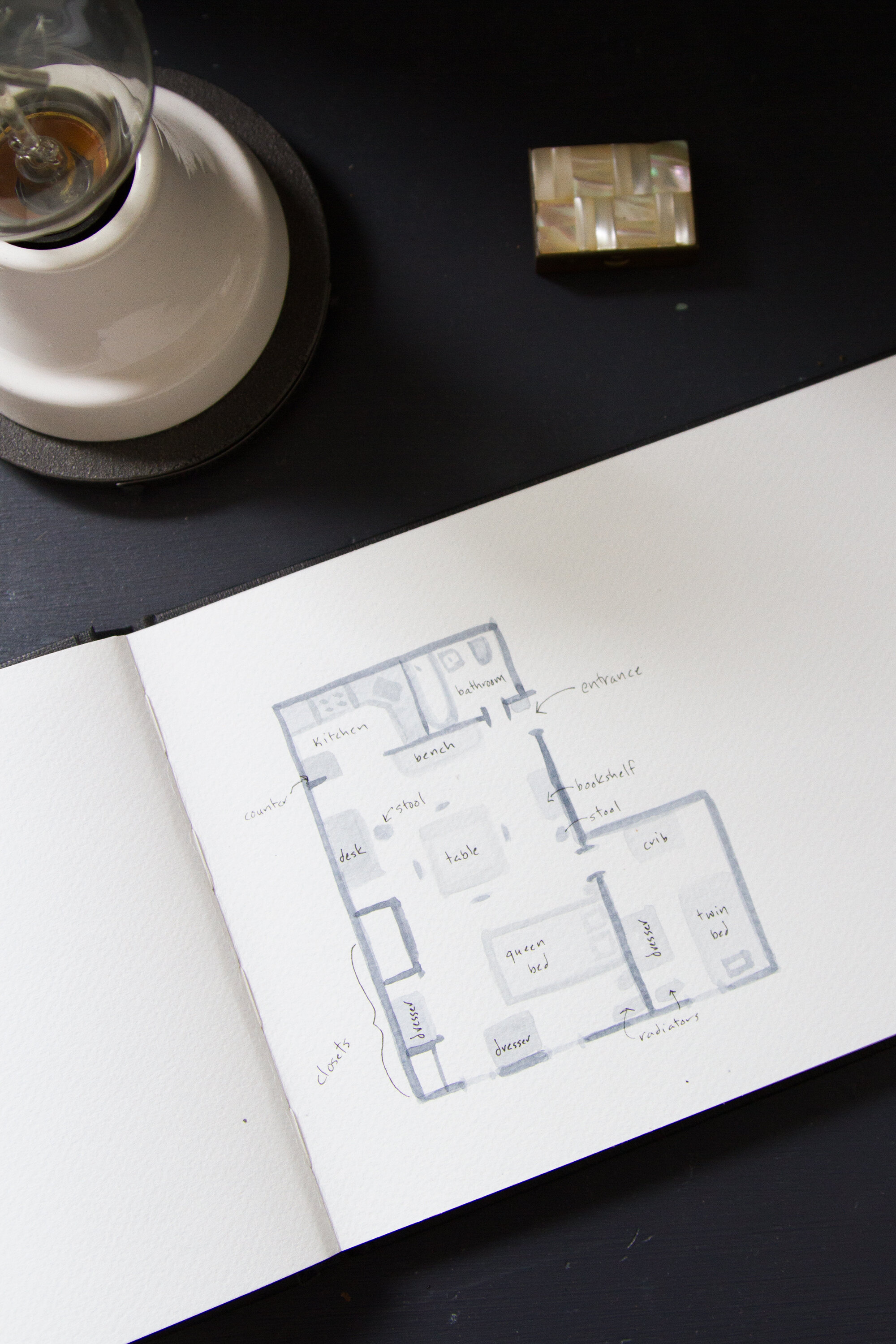
Here’s a watercolor version of our current apartment floor plan.
I get a kind of bizarre number of requests for floor plans and I’m not sure why, but the requests kind of creep me out. Creep is probably too strong a word and we’ll blame my reaction on recurring childhood nightmares related to the Lindbergh baby. Nevertheless, a floor plan seems like an intimate thing to ask for, like a peek inside my underwear drawer. (But then, of course: Sigh.)
I think my real hesitation to share a detailed floor plan is that it feels that implicit in the request for a plan—or the delivery of one—is an idea that a home is static. If I was very ambitious, I would have painted at least seven different versions of this plan. Each different plan would reflect a major shift that we’ve made along the way to making our space work for us. The loveseat in one spot, the loveseat in another, the loveseat no longer here at all…to say nothing of bed or crib or desk. Short of moving walls and major appliances, almost everything in this space is subject to change, nearly all the time. The truth is that this month’s floor plan might not be next month’s floor plan.
The internet and the accompanying glossy images we scroll through give us the impression that homes are finished spaces, when of course they’re works in progress. Especially in small spaces and especially with a growing family and changing needs, the spaces where we make ourselves comfortable get to change. I’m not suggesting that we all engage in an endless and exhausting game of musical chairs, but I do think that thinking of our homes—and other people’s homes—as mutable is a helpful exercise.
All that said: Enjoy this floor plan. It’s what our place is looking like on this September morning in 2016. Now just don’t blink.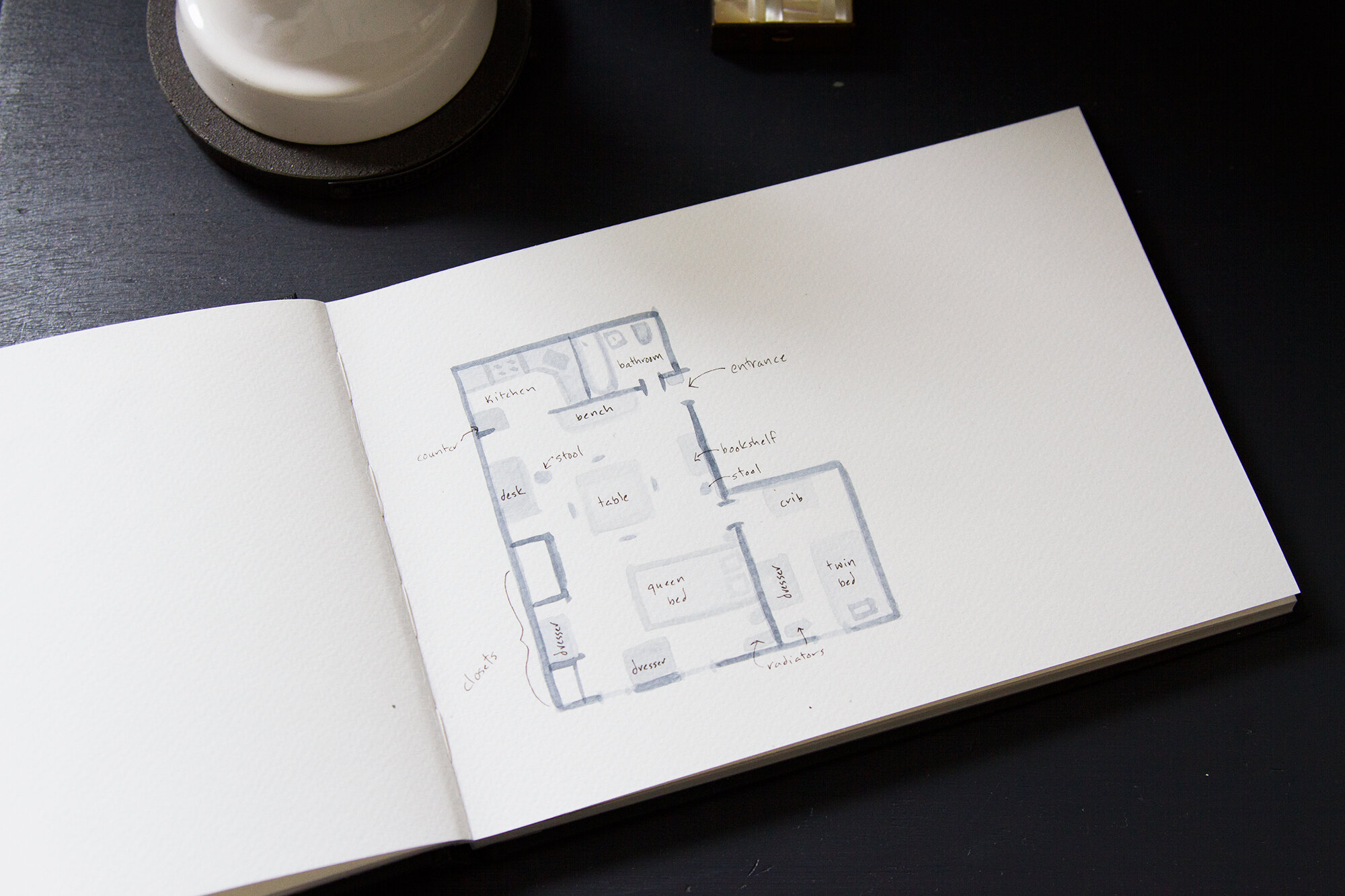
PS. I’ve written about some of this before:
Here’s a piece on why I prefer to go (mostly) rug-less.
Here’s another on rearranging.
Here’s a real oldie on switching out artwork.
Tiny apartment survival tips #1 – 143, RIGHT HERE.
(Speaking of (intimate and) frequently asked questions: I updated my FAQ.)



16 Comments
i really enjoy this series.
All of this just reminded me how much I love the book “Gift of the Sea” by Lindbergh, what an amazing woman who overcame such a tragic story. Have you read it :)?
Loved your watercolor floorplan, so sweet 🙂
Love this ! Yes, a house is not static. So many quotable ideas from your blog jump into my life.
I’m not sure if I should be ashamed or not but I’m definitely one of the ones that have asked for a floor plan lol. My husband and I will be building a tiny house soon and are always so interested to see what works for other people who also love and live tiny. I love getting to see how you both make the space work especially with little ones since we don’t have children yet. Thank you for sharing
No shame 😉
I completely understand the desire for people to see a floorplan of a space, especially when they are regularly shown just close-ups of decor in said space. I personally cannot get enough of floorplans in any capacity; I am always bummed when home or apartment listings don’t offer one, because seeing one truly helps my brain to orient around the space and imagine myself there. Wanting to see a floorplan of a home is as much about seeing how the living space relates to the bathroom and relates to the kitchen, etc., as it is about where furniture is placed. (I would argue that the former is most people’s primary interest.) Because the windows, kitchen, bathroom… those *are* static. It’s so fun to see empty floorplans and imagine how you’d utilize the space if it were your own!
All that to say, though I have not ever personally asked you for one: thank you for sharing a bird’s eye view of your tiny apartment to help us better understand the overall space you continue to inspire us with.
Totally understand the interest, though like most aspects of having parts of your life on display, it takes some getting used to the frequent requests.
Just curious (because we are trying to rearrange our super tiny cottage to accommodate the arrival of our first baby in a few weeks, think about how to maximize adult sleeping time, and have the added challenge that our bed currently is in a loft that requires going up a pretty steep ladder)–who sleeps in the twin bed?
Sorry to pry more into your floor plan!
Haha! No worries! Faye is in the twin bed so she has plenty of time to get used to it before the crib gets used by the new baby come January!
Nevermind–I just got caught up on the news…the bed is for Faye!
😉
This made me laugh. Love it. And the watercolor floor plan. Very nice.
I LOVE floorplans. Any time I read a magazine feature or see a real estate listing, I study every photo to deduce the layout. Of course I had long ago deduced yours (because you probably weren’t creeped out enough, right?) but it was nice to have it confirmed, and in such a pretty watercolor version too!
Thank you for sharing 🙂
Haha! So glad you like it!
I just finished your book. It was great. I also love floor plans, but that might be from my job as a building design engineer. I love seeing how things work/fit together. I need the whole picture. Thank youfor the watercolor version!
So simple and so beautiful! I love the water color floor plan. I’m an interior designer, so I work with floor plans all the time.
Comments are moderated.