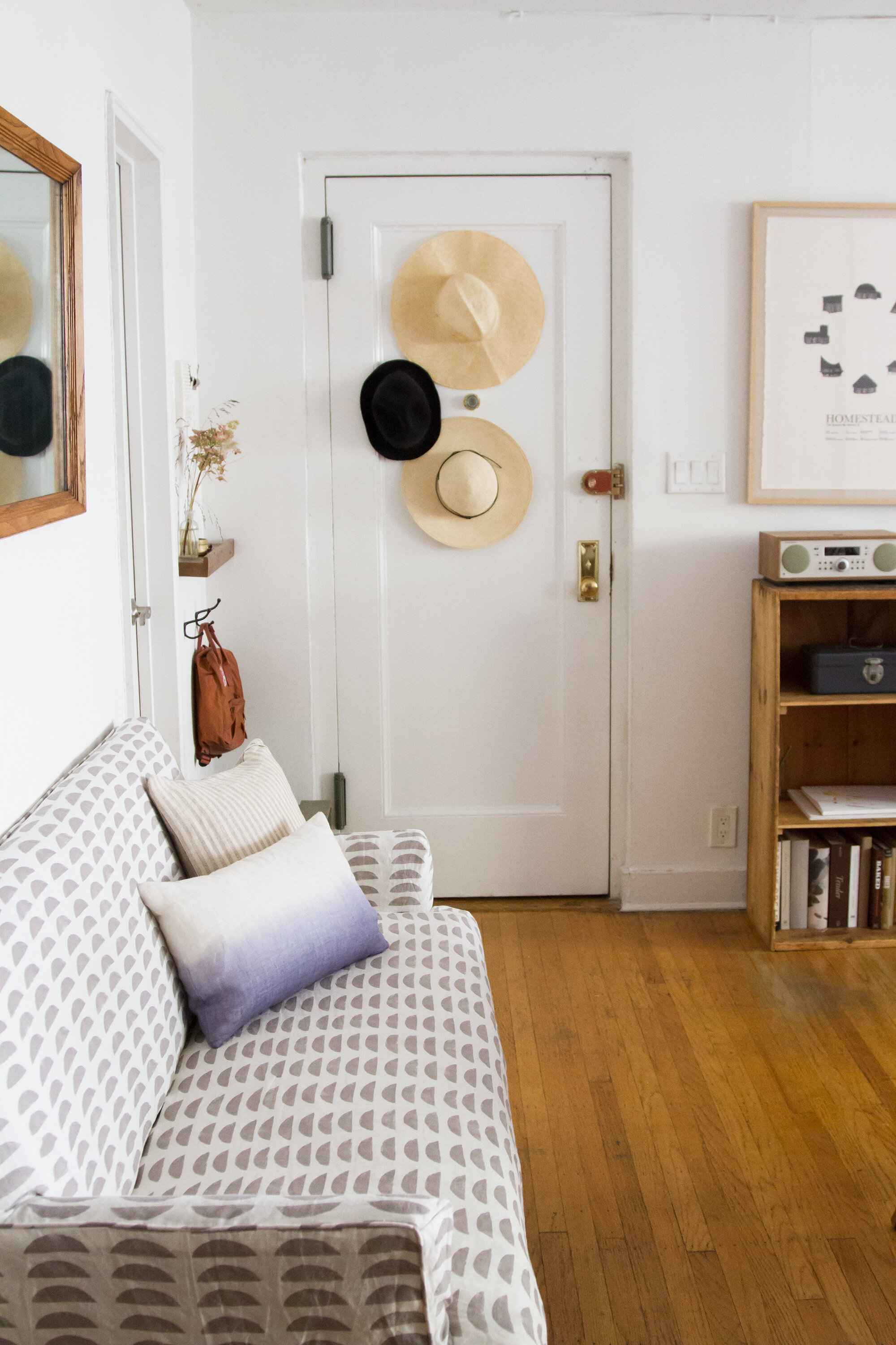
Tip #145: Don’t be too afraid of pattern.
I’m the last person, really, who should be giving advice on introducing patterns into a small space. My typical counsel would fall somewhere along the lines of: Don’t. But like so many things related to surviving in a tiny apartment, that’s a personal preference and not some kind of commandment. In other words, it’s not that you shouldn’t introduce pattern when space is limited, it’s just that I typically don’t. I’m scared is why. Scared of committing to something that might feel dated too quickly and scared of feeling claustrophobic. Scared, especially, of being fickle myself.
This summer, my friend Rebecca Atwood, finally gave me the nudge to integrate a little pattern into our space. Truth be told, she’s been trying to give me the nudge for the past two years, it’s just that I’ve only now conceded, convinced in part by her brand-new book. Becca’s got a particularly good eye when it comes to both creating patterns and incorporating them into rooms. More than that, we share a certain fondness for the same colors. Both of us grew up on New England beaches and her muted color choices remind me of those places. (If you ever wanted to know where I look to for inspiration, just think of the blues and browns and grays of a mussel-strewn shoreline.)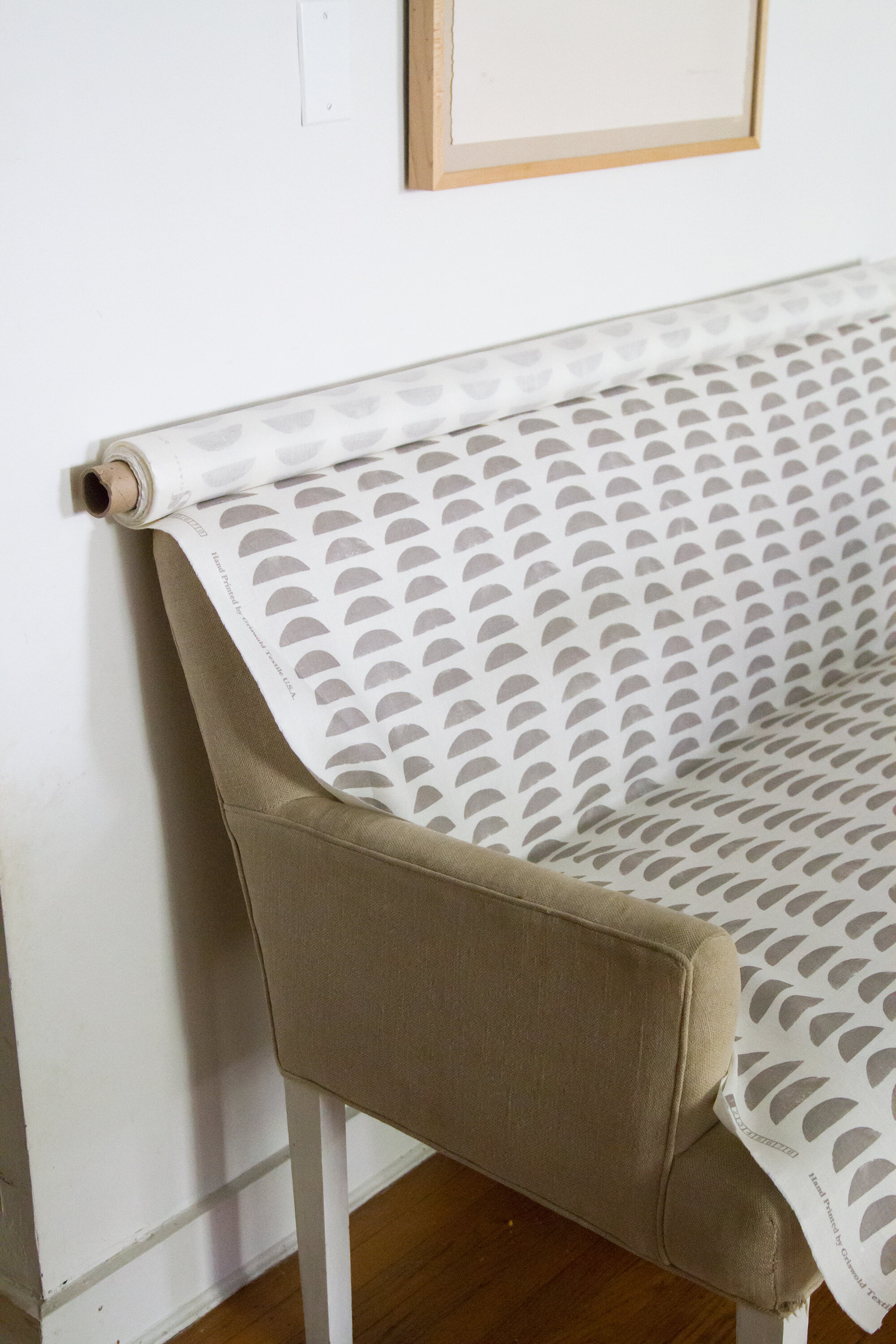
Finally convinced to dip into the world of pattern, I decided to do a swan dive.
Remember our upholstered bench? The thing that we moved in here last spring and that I resolved to immediately repair and slipcover? Well, better late than never.
Having come to grips with the fact that I don’t know how to make a slipcover myself, I outsourced the work of the construction to a local upholstery business. The husband and wife team behind H & A Upholstery (Hector and Ana!) practiced their magic and made a super simple cover to match the integrity of the original pared-down bench. Best part is: it’s washable, which is good thing when there are errant plum-torte fingerprints ready to pounce.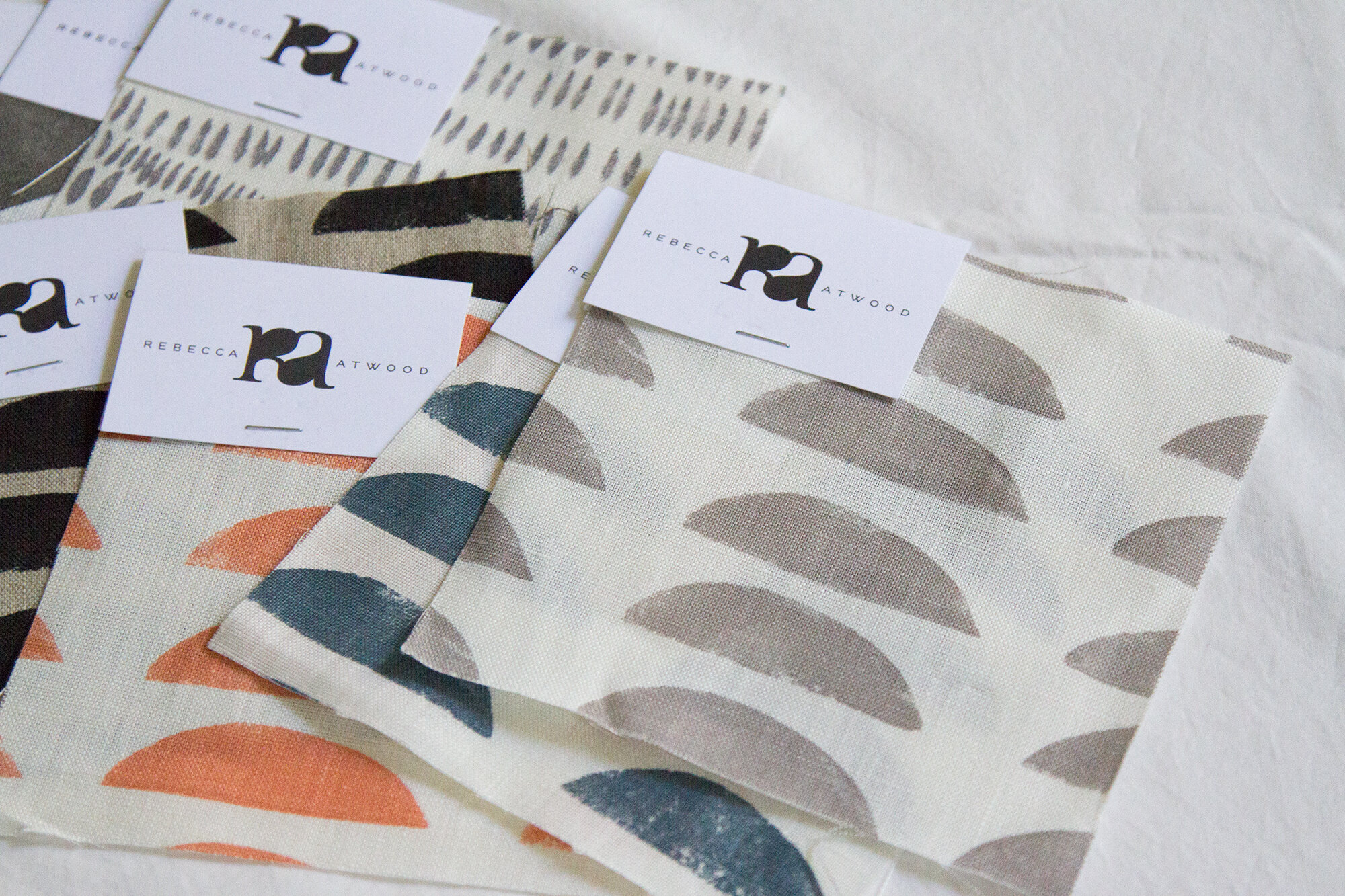
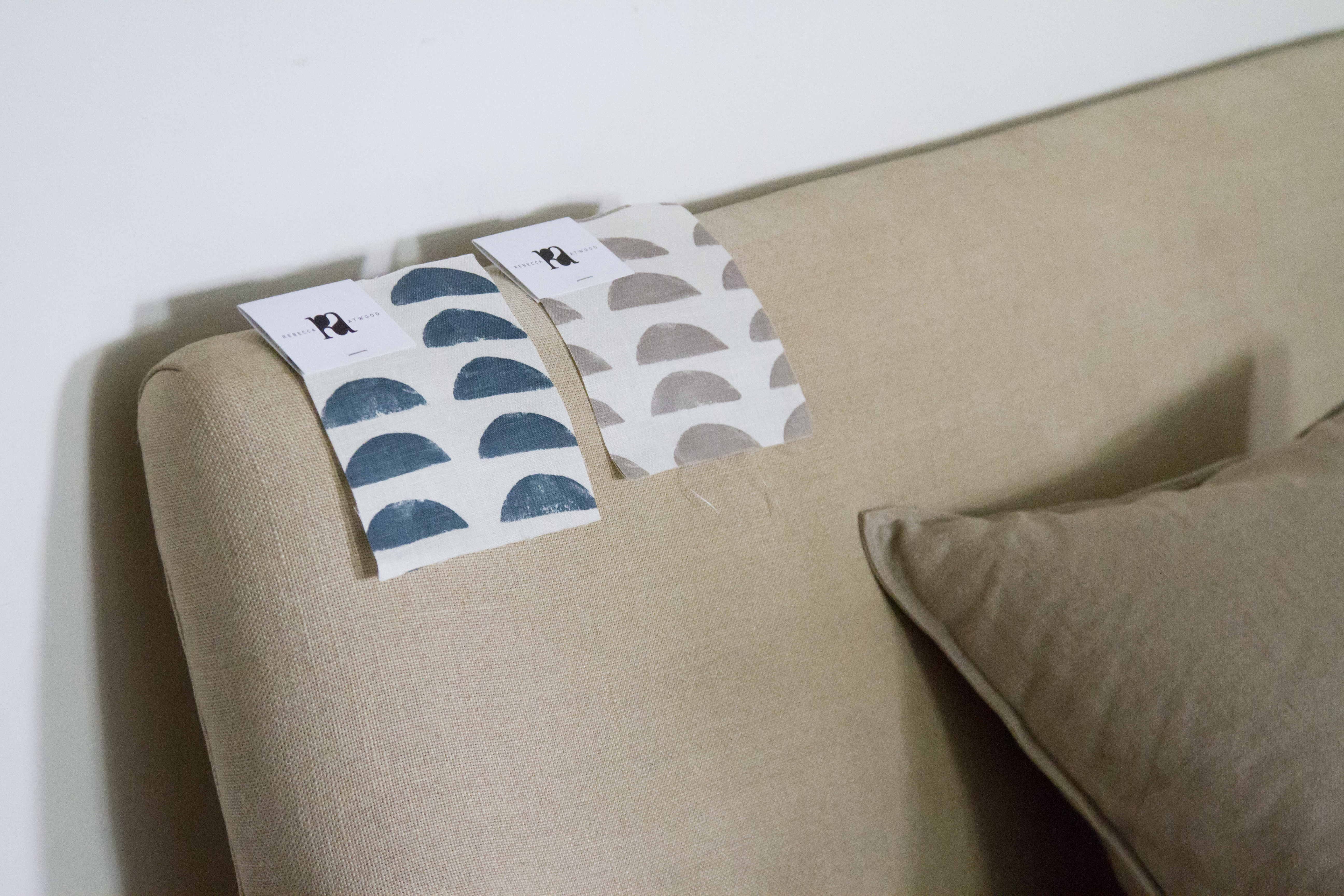
I followed Becca’s sage advice and chose a pattern from her line that falls firmly within the existing color palette of our apartment—the Hills fabric in the gray-wood colorway. I love the simplicity of the print—and the fact that Becca made it using a potato as her stamp. It’s an old-school approach to making a pattern and in this application the result is a design that feels both modern and timeless.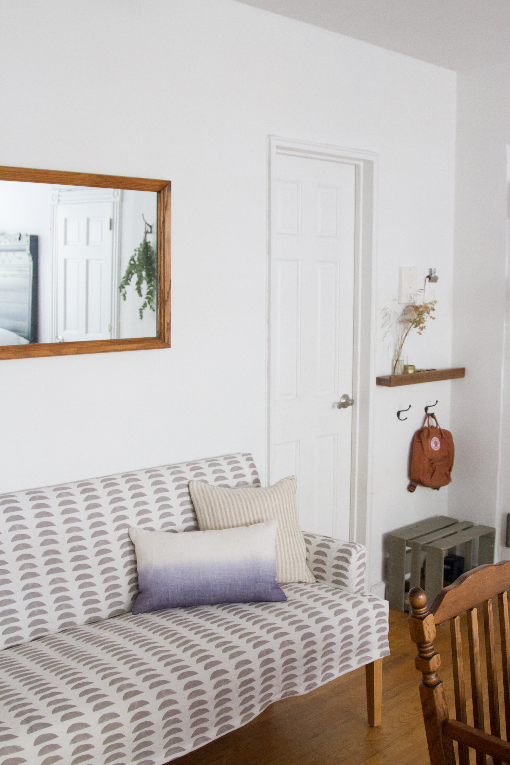
Nestled into the same short wall between our kitchen and bathroom where it was before, the newly punchy bench feels about ten times more inviting than its ripped up predecessor. The linen, which I washed before having the slipcover made (to account for any shrinkage), is soft and rumply but the cover itself is tailored enough to prevent it slipping into shabby chic territory.
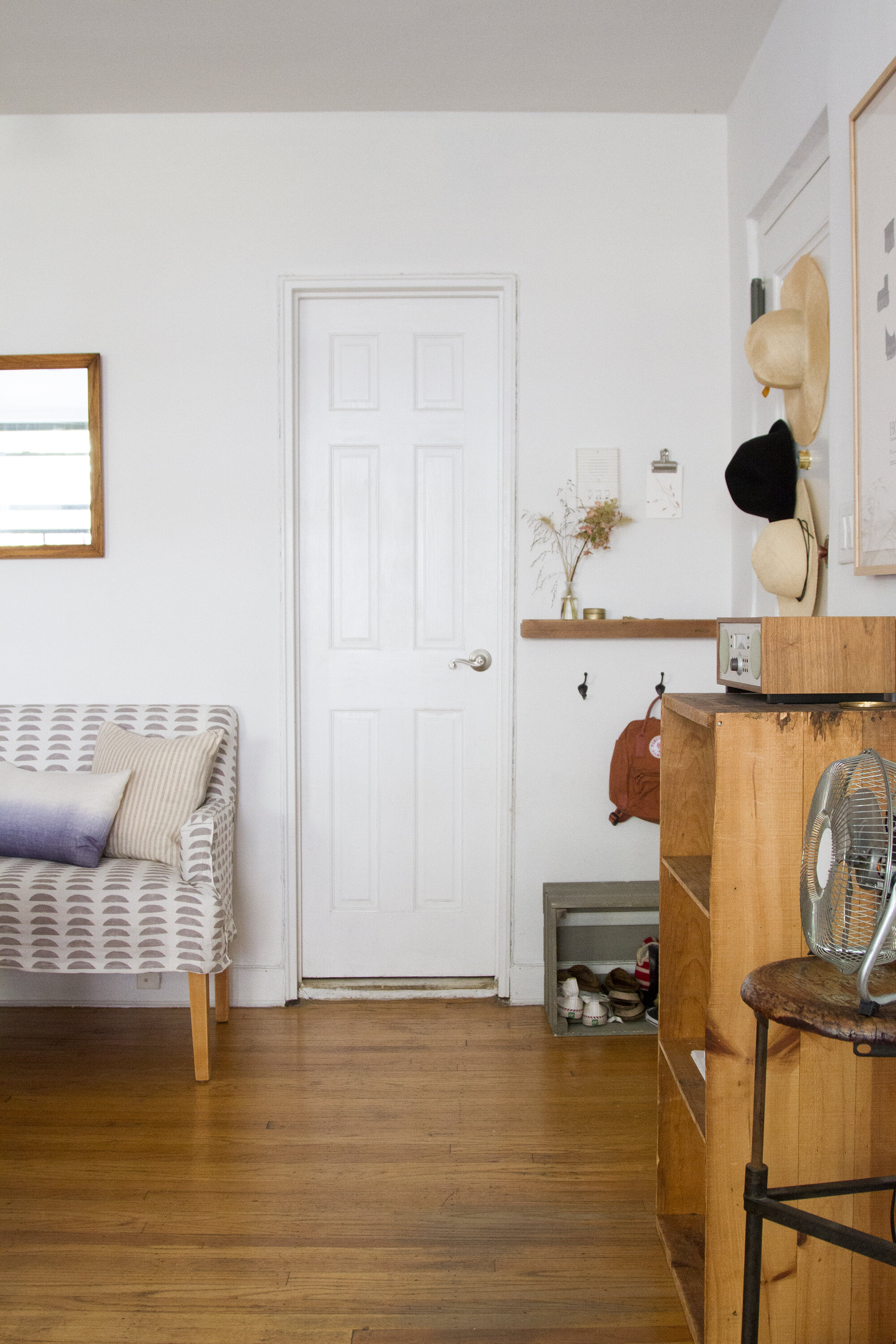
To my honest surprise, all this pattern required very little getting used to. The brighter color contrasts nicely with all of the bare wood we’ve got going on in here (including the bench’s newly sanded legs) and adds some needed lightness to the shady side of our apartment.
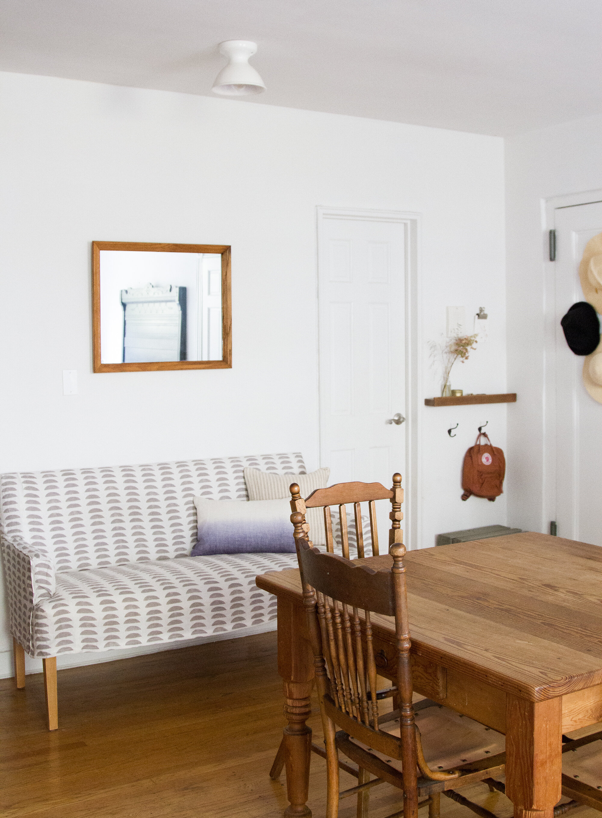
Livable pattern, is what I’d call it. Not too much, not too little. Just right.
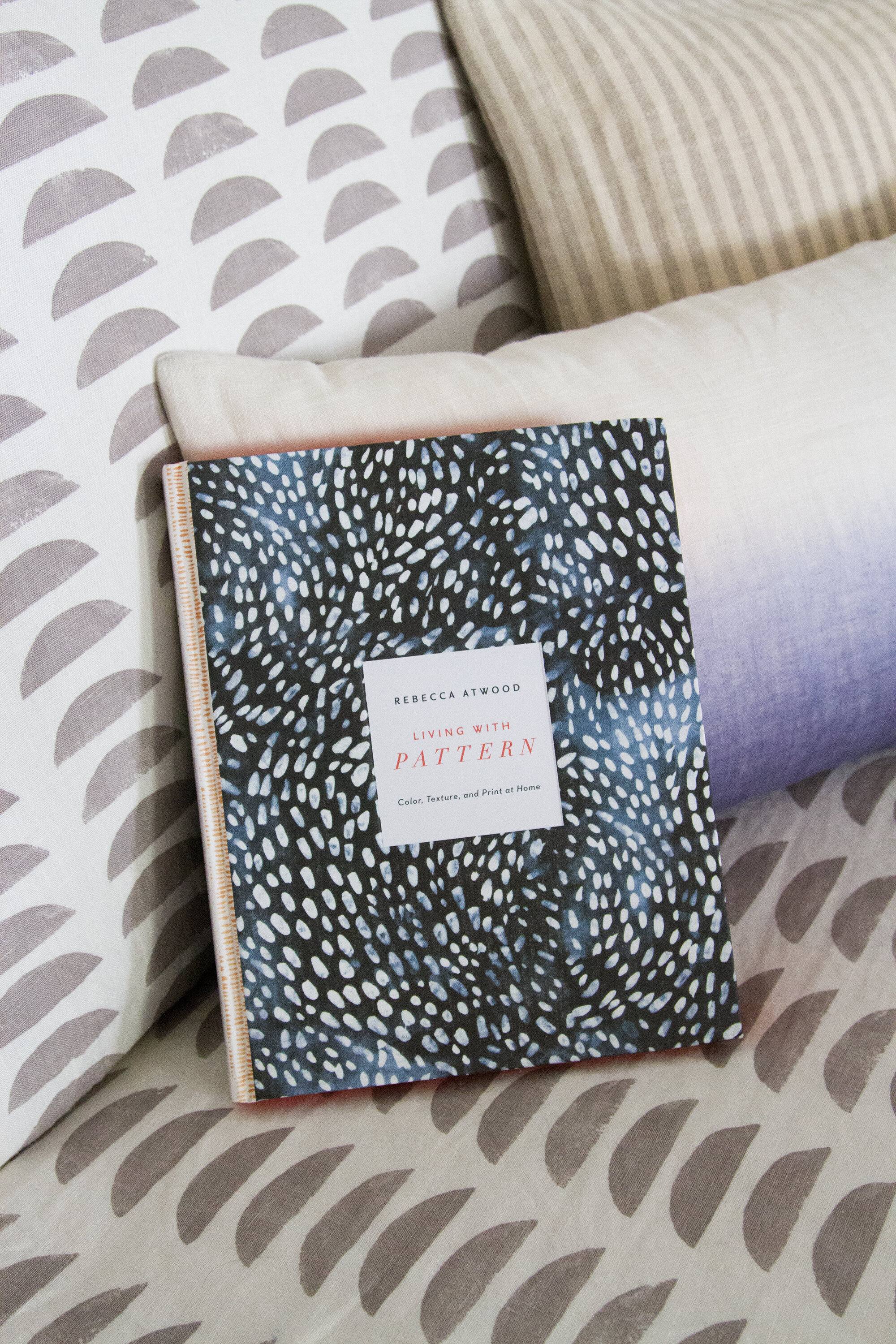
For lots more pattern inspiration from the real expert, and for peeks into projects and homes far more ambitious than my own, you can check out Rebecca’s brand-new Living with Pattern: Color, Texture, and Print at Home.
If you need a little reminder on homemade upholstery cleaner, HEAD HERE.
Tiny apartment survival tips #1-144, RIGHT HERE.

43 Comments
Oh, it’s lovely, Erin! Just perfect. Hector & Anna did a beautiful job on the slipcover & the sanded legs are just right. High five!
Thanks so much, Carmella! Slipcover queen!
Looks great!
Hi There- I’m wondering where the shelf on the wall of your entryway is from? Thank you!
It’s from West Elm—several years ago at this point but they still might make them!
Love Atwoods line! They are all so pretty! I have to disagree from the advice though. A little bit as even a very nice camera and lens can have trouble focusing in a meadow, for example, if there are a lot of different but similar plants and greens, using the same color pallete may confuse and overwhelm the eye. Specially in a small apartment. I think the tangerine one would be still soothing and neutral but breaking down the visuals which is eye frindly, which results in living long term with a pattern better.
Ah, but I find working with a limited palette to create a space that feels soothing and calm. Better for longterm living with pattern for me, for sure.
English not being my first language and since in years I just read it and write it (rarely talk out loud in English) I never know when my tone is off. The sofa looks great, I just came to conclusion above when I saw the post but it wasn’t to be said like a “rule” it was just an idea I had and thought it out loud 🙂
Totally understood! No rules 😉
Erin – I love how it turned out! Thank you for making something so lovely with my fabric.
I hope you enjoy it!
Lovely! I have your book on my coffee table and I find it inspiring (now I need to add Rebecca’s).
How do all you creatives always know each other? Do you have a art/design/awesome people club? LOL
🙂
I love it! I am really excited about Rebecca’s book – I might gift it to myself someday soon 🙂
Where did you get that pretty ombre pillow?
I found that little dip-dyed indigo pillow at ABC Carpet & Home here in the city!
Ooh. I’ve been puzzling over what to do about the arms of our couch which have been (lovingly) scratched up by the recent addition to our home, our kitty. We’ve settled for blankets over the arms, but a slipcover sounds perfect. P.S. if anyone has slipcover fabric ideas that discourage/hide claw marks, please let me know!
Love it!
How lovely it looks. Thank you for this blog. It’s a beautiful and calm place to come to (when the rest of the world seems crazy).
Question from a fellow apartment-dweller. Where do you sand your furniture? Do you carry it out to the street or does it work to put down newspaper in your apartment? Bench looks great!
Totally depends on the piece, but this was an easy piece that really only needed a light sanding to remove one coat of paint. We did right onto the floor and then vacuumed and mopped it up!
Erin I love what you did with my sister’s fabric! Gorgeous post. xx
Thanks so much, Grace! So thrilled to have a little bit of Becca’s work in our place!
I love a good pattern but find it intimidating at the same time. Hopefully one day i’m game enough to give it a go as well!
Looks fantastic – well done all round, to everyone involved!! 🙂
Rxx
Your home is exceptional!
May I ask what kind of hanging plant that is reflecting in the mirror above the bench? Many thanks!
It’s a drying eucalyptus branch!
The couch looks gorgeous. I would have gone with blue, because I’m not afraid of color, but the gray is very nice. The pattern is perfect for a small space, not too busy or overwhelming.
The pattern reminds me of watermelon pieces…a rosy red would look great as well as the pattern on her cover would also add a nice punch to your nook. Happy lounging on your latest touch to your nest. Does she do area rugs too?It would make it oh so cozy to warm up some toes on it.
Ha! Not exactly going for the punch look myself, but agreed a rosy red would be lovely in someone else’s space!
PS: No rugs yet, but she is introducing throws and other textiles this fall!
Hi Erin! Love how the couch turned out. I am afraid of pattern myself due to the fear of getting tired of it. I noticed the hats on the entrance door. Can you share which kind of hooks you used? I am contemplating doing the same. Thank you.
Our apartment door is steel, so these are little magnets with tiny hooks on them!
It’s gorgeous!
Love this fabric so much. Restful and soothing, but lots of interest. How was the front edge finished–does it just hang down or is it attached under?
It’s hemmed, but it hangs like a very short skirt!
Love this! We’ve just moved into a small Hong Kong apartment so have been reading your advice, we absolutely loved e our small space but have been really timid about adding pattern, we know have black and white chevron pillows on our sofa and they look ace!
Gorgeous! It looks fantastic in the room.
Wow, this looks amazing! Love the mix of patterns with the rest of your decor and wood furniture.
thanks for nice sharing 🙂
Hi Erin,
Would you mind sharing where you got your magnetic hooks for your door? Thanks!
I think I got mine at Brookfarm General Store, but it doesn’t look like they still carry them! Lots and lots for sale on sites like Amazon though:http://amzn.to/2vFlgjv!
The sofa – long thin legs! We live in a tiny place too and we’re looking for a not HUGE sofa.
Can you tell us the make/mfg of the sofa?
It’s so great isn’t it? My sister bought it ~10 years ago from a sample sale in Austin, TX. It’s not marked so I’m afraid I don’t have more details!
Comments are moderated.